-
Notifications
You must be signed in to change notification settings - Fork 0
/
Copy pathWeek_1_critique.Rmd
42 lines (24 loc) · 2.16 KB
/
Week_1_critique.Rmd
1
2
3
4
5
6
7
8
9
10
11
12
13
14
15
16
17
18
19
20
21
22
23
24
25
26
27
28
29
30
31
32
33
34
35
36
37
38
39
40
41
42
---
title: "Visualization Critique"
author: "Etienne Rolland"
output: html_document
---
```{r setup, include=FALSE}
knitr::opts_chunk$set(echo = TRUE)
```
## Visualization Link
*Please provide a link to your visualization critique.*
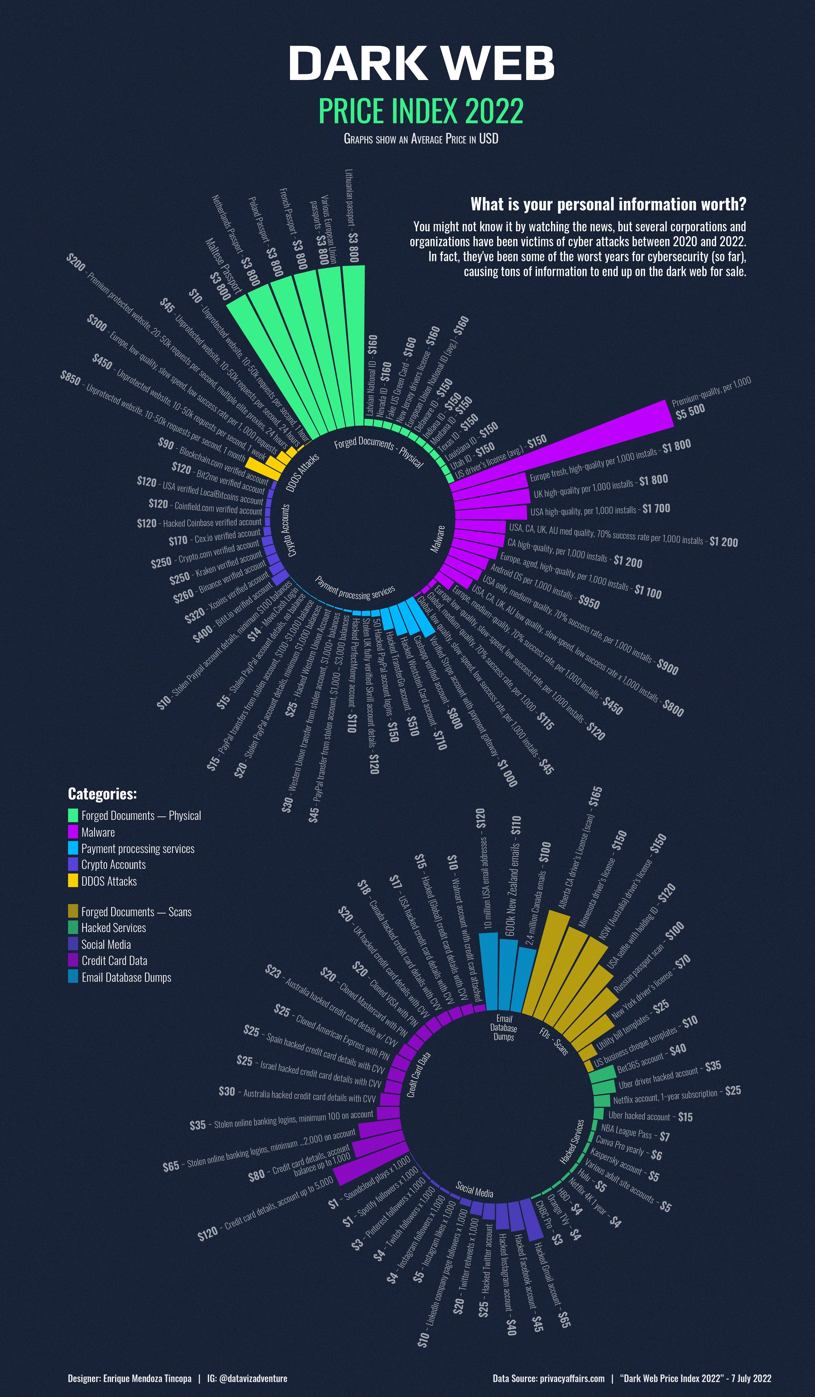
[The Dark Web Price Index](https://www.visualcapitalist.com/wp-content/uploads/2022/11/Charted-The-Dark-Web-Price-Index-2022-Full.html).
## Weakness
*What do you see as a significant weakness of this visualization? How could you improve it to make it clearer, easier to understand, or more impactful? Make sure you provide some detail in justifying your answer.*
### Colors palettes
Two differents colors of palettes should have been used for eachs graphs. Instead, here, one palette is just a subdued version of the other.
This lead to the misleading assuption that there is a relationship between the categories of the two graphs. For example, there is not relationships between *DDOS Attack* and *FDS - Scan*.
Subdued colors should be only used to create accent color scales, as developped here : https://clauswilke.com/dataviz/color-basics.html
I would have use a totally different palette, with orange and other colors not present in the first graph.
## Strength
*What do you see as a strength of this visualization? Is there a specific choice of the designer that made it especially useful or impactful? Make sure you provide some detail in justifying your answer.*
* The type of the graph used : a circular barplot. Even if this type of graphs are visually appealing, they are hard to use properly. Here, this use is plainly justified : there is several grouping variable (Malware, Forged Documents), and the plot make it is easy to compare groups as well as entities into each group.
* They cut the visualization into two graphs based on their price scale, the second graph having only categories with small range of price (1\$ to 165\$). This split of the data make more things more readable and price more easy to compare.
Also, circular barcharts make sense we you have a huge number of bar to display, which is the case here.