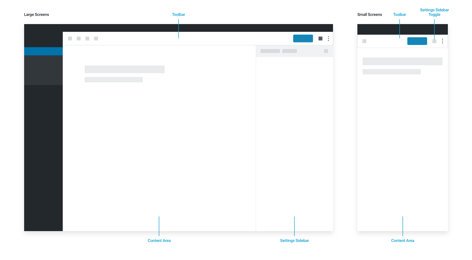
The block editor’s general layout uses a bar at the top, with content below.
The Toolbar contains document-level actions: Editor/Select modes, save status, global actions for undo/redo/insert, the settings toggle, and publish options.
The Content Area contains the document itself.
The Settings Sidebar contains additional settings for the document (tags, categories, schedule etc.) and for blocks in the “Block” tab. A cog button in the toolbar hides the Settings Sidebar, allowing the user to enjoy a more immersive writing experience. On small screens, the sidebar is hidden by default.
The block itself is the most basic unit of the editor. Generally speaking, everything is a block. Users build posts and pages using blocks, mimicking the vertical flow of the underlying HTML markup.
By surfacing each section of the document as a manipulatable block, we surface block-specific features contextually. This is inspired by desktop app conventions, and allows for a breadth of advanced features without weighing down the UI.
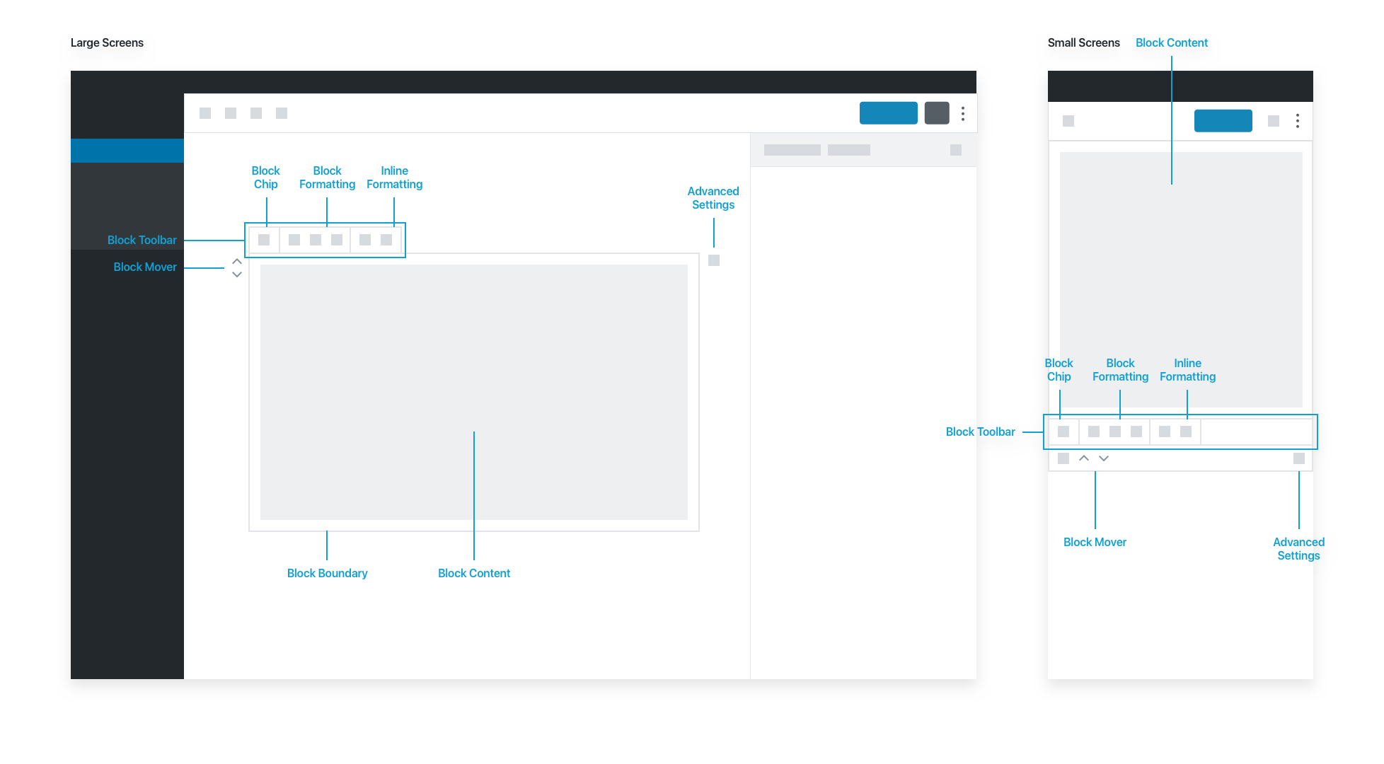
A selected block shows a number of contextual actions:
The block interface has basic actions. The block editor aims for good, common defaults, so users should be able to create a complete document without actually needing the advanced actions in the Settings Sidebar.
The Block Toolbar highlights commonly-used actions. The Block Icon lives in the block toolbar, and contains high-level controls for the selected block. It primarily allows users to transform a block into another type of compatible block. Some blocks also use the block icon for users to choose from a set of alternate block styles.
The Block Formatting options let users adjust block-level settings, and the Inline Formatting options allow adjustments to elements inside the block. When a block is long, the block toolbar pins itself to the top of the screen as the user scrolls down the page.
Blocks can be moved up and down via the Block Mover icons. Additional block actions are available via an ellipsis menu: deleting and duplicating blocks, as well as advanced actions like “Edit as HTML” and “Convert to Reusable Block.”
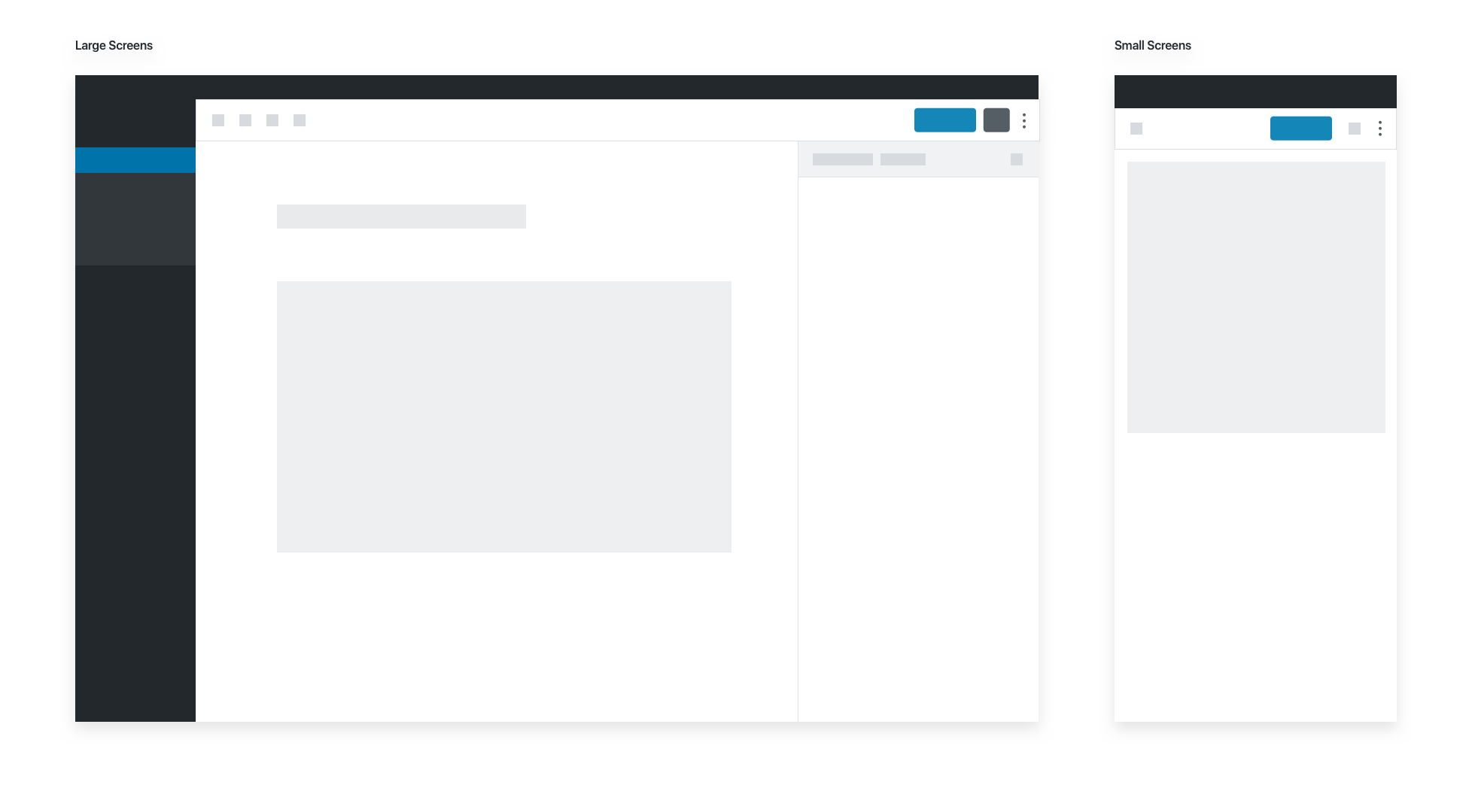
An unselected block does not show the block toolbar or any other contextual controls. In effect, an unselected block is a preview of the content itself:
Please note that selection and focus can be different. An image block can be selected while the focus is on the caption field.
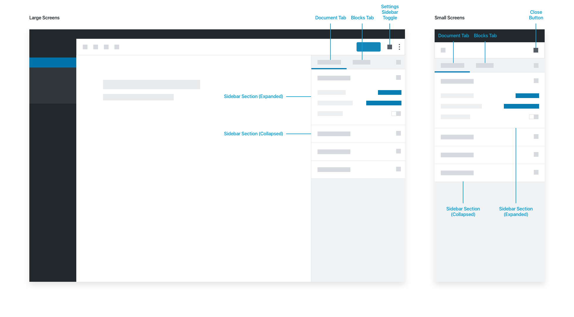
The sidebar has two tabs, Document and Block:
- The Document Tab shows metadata and settings for the post or page being edited.
- The Block Tab shows metadata and settings for the currently selected block.
Each tab has sets of editable fields (Sidebar Sections) that users can toggle open or closed.
If a block requires advanced configuration, those settings should live in the Settings Sidebar. Don’t put anything in the sidebar block tab that is necessary for the basic operation of your block; your user might dismiss the sidebar for an immersive writing experience. Pick good defaults, and make important actions available in the block toolbar.
Actions that could go in the block tab of the sidebar could be:
- Drop cap, for text
- Number of columns for galleries
- Number of posts, or category, in the “Latest Posts” block
- Any configuration that you don’t need access to in order to perform basic tasks
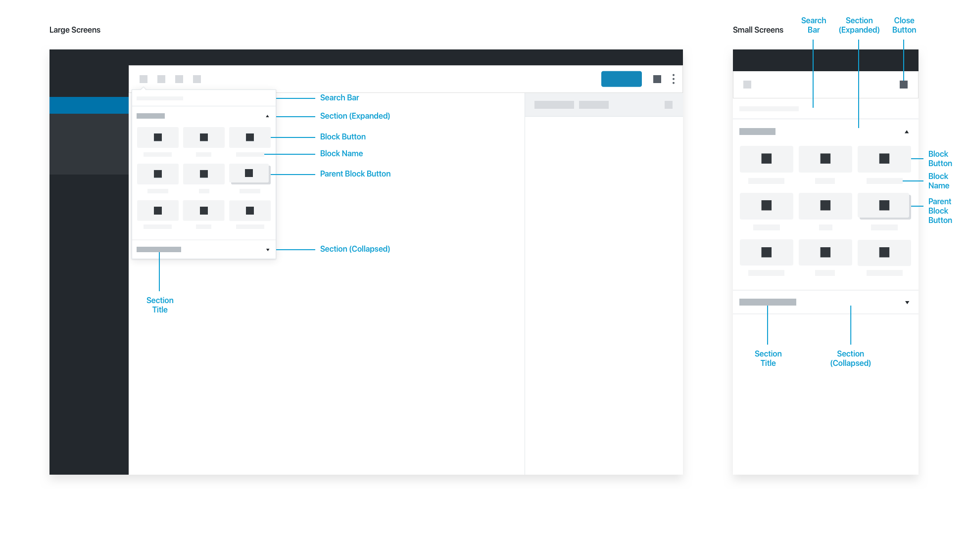
The Block Library appears when someone inserts a block, whether via the toolbar, or contextually within the content area. Inside, blocks are organized into expandable sections. The block library’s search bar auto-filters the list of blocks as the user types. Users can choose a block by selecting the Block Button or the Block Name.
