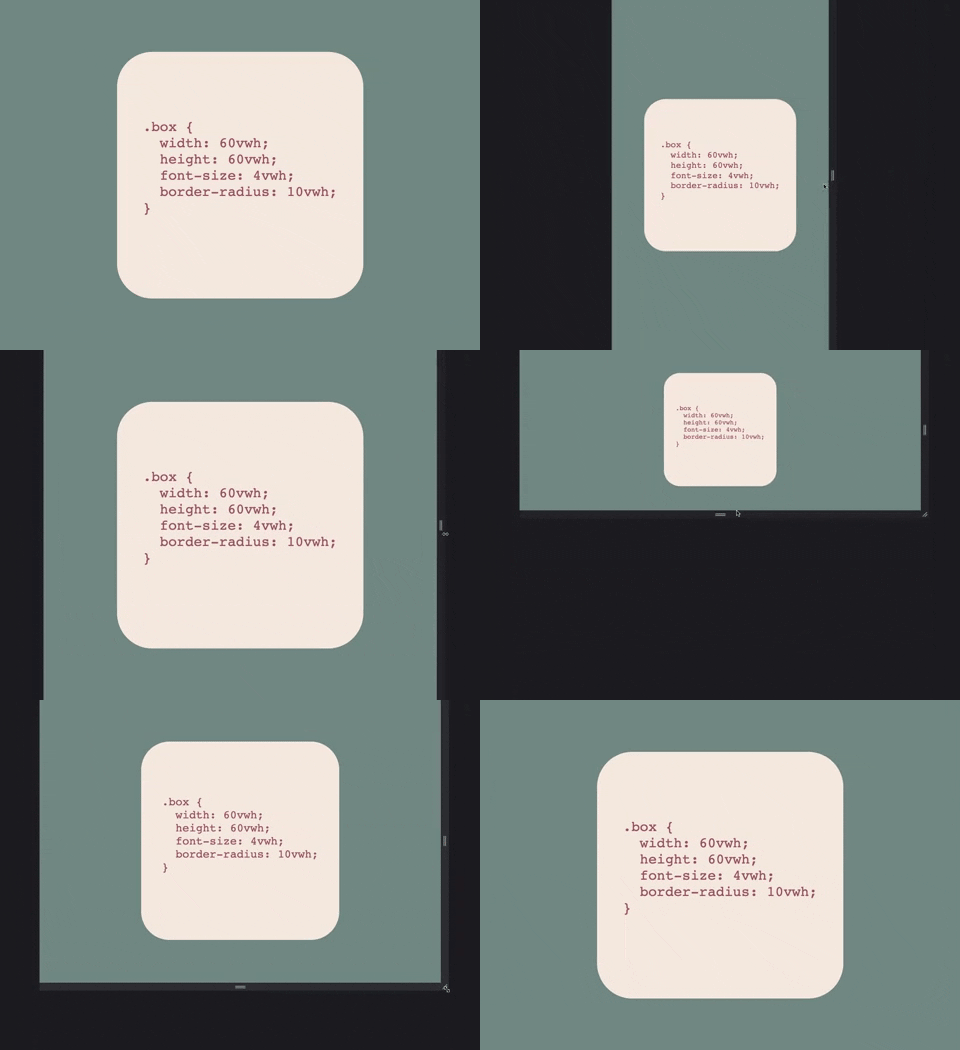
PostCSS plugin that adds support for vwh unit.
/* Input example */

div {
    width: 50vwh
}
/* Output example */
@media (orientation:landscape) {
div {
width: 50vh
}
}
@media (orientation:portrait) {
div {
width: 50vw
}
}vwh can help naturally create responsive elements that retain their proportions and evenly scale with the viewport regardless of its orientation.
Step 1: Install plugin:
npm install --save-dev postcss postcss-vwhStep 2: Check you project for existed PostCSS config: postcss.config.js
in the project root, "postcss" section in package.json
or postcss in bundle config.
If you do not use PostCSS, add it according to official docs and set this plugin in settings.
Step 3: Add the plugin to plugins list:
module.exports = {
  plugins: [
+   require('postcss-vwh'),
    require('autoprefixer')
  ]
}