openSUSE Brand Logo refresh #93
Comments
This comment has been minimized.
This comment has been minimized.
This comment has been minimized.
This comment has been minimized.
|
While coming up with some concepts here is a great idea, ultimately this will need to go to the opensuse-project mailinglist for discussion on if and what we want to change the logo too, then the board will need to take it to SUSE for legal / trademark fun. |
This comment has been minimized.
This comment has been minimized.
This comment has been minimized.
This comment has been minimized.
This comment has been minimized.
This comment has been minimized.
This comment has been minimized.
This comment has been minimized.
This comment has been minimized.
This comment has been minimized.
This comment has been minimized.
This comment has been minimized.
This comment has been minimized.
This comment has been minimized.
This comment has been minimized.
This comment has been minimized.
This comment has been minimized.
This comment has been minimized.
This comment has been minimized.
This comment has been minimized.
This comment has been minimized.
This comment has been minimized.
|
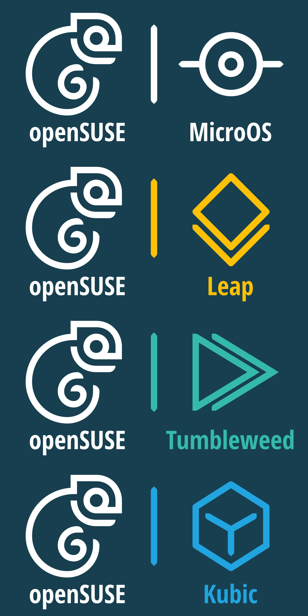
Continuing the issue, some more logos of course:
|

|
Second set is great. It also better shows the "smile" of the chameleon, which I think can be an important facet of the logo. It's also less busy. |
|
I'll second that I think the "Line style" logo's kinda look cool for a t shirt or something of that nature especially with some neon styling, but I don't think its as easy to integrate into a lot of designs, I think the design style looks out of place sitting next to other applications either as a "start" button on a tray or as a circular logo for something like discord or any other avatar, one of the things I like about the existing logo is we have an "avatar" form that is recognisably associated with / part of the current logo but that we allow people to customise as they see fit (see my avatar) and I don't think that works as well with this icon. I also think if we are changing the icon we don't need to stick to the current branding / color palettes as they were designed around the color of the old logo, so I think we should put together 2-3 new alternative color palettes still with green as the core color but with an easier green to work with. As much as i'm not always a fan of "flat" style UI's I think that in this case some form of flat style icon is probably the best way forward. If I get some time i'll also throw some proposals in although my design skills aren't the best |
|
Since it has a fan base on Discord but was not added here, I would like to throw this one into the mix.
|

|
I agree with @simotek . Tshirts and other marketing materials allow for creative and artistic expressions of our logo, however, when thinking about changing a long (over 15 years) recognized trade logo we need to be more cautious. We want to create a positive impact. In my very personal opinion, the logo proposed by @MAU-g is a much better transition from the current openSUSE logo to a more modern look and feel. I can see more resemblance of the current openSUSE brand in it and I also like the shade of green used. |
|
@cyntss seems like it's GNOME HIG green. It's certainly better than current green :P I think regardless it would be nice to aim at something bluer than yellower for new green, which this one certainly is I'm not 100% happy about the filled geeko, but I probably should look into what could be improved, because it was a rough idea more than anything ;) |
|
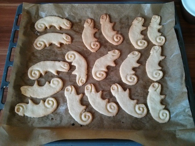
Line geeko would work well for pretzels ;) |
lol always happy to eat chameleon shaped cookies :D |

|
Here is a concept that someone with much better design skills can probably make better
|

|
hmm, but you do know the difference between a geeko and a tadpole? Your designs look more and more like random insects (or cute owls in the case of @hellcp's 2nd proposal) than an opensuse logo. Sorry to say, but I'm afraid you lost yourself in the discussion (not on discord so I can't say for sure how it happened). |
|
I am not a graphics person, but we had some art commissioned a few times for stuff we did at SCaLE. I really like the Geeko used in our openSUSE miniSummit at the Southern California Linux Expo a few years back. I have the
|

|
The logo from @athano looks nice. Albeit it does not remind me on a chamæleon, but on a mixture of sea horse and tadpole, because it has not visible limbs at all. :-) |
|
Dear folks, |
I like the first two logo sets the most. The other logos are way too cute for me. :-) |
This comment has been minimized.
This comment has been minimized.
This comment has been minimized.
This comment has been minimized.
This comment has been minimized.
This comment has been minimized.
|
That distresses the way of expressing itself of many here; I do not say it for something personal, if not that regardless of the idea here it is looking to give freshness to something and have a marked difference, all the changes generate this friction but they are always for the good. The worrying thing here is that the idea of a logo is not born at the root of that it looks nice, or that you like it or not, or if the time is ugly, if it is not seek to condense the meaning of the brand or the approach that we want to give I have always believed that the pure and simple criticism without hairs on the tongue is what helps you grow, that you soften criticism does not help; but he is not focusing on the subject at the end. For my part I am willing to support what they need, but it is difficult in a democracy where there are no processes to redirect opinion to take it to the common goal. |
|
According to the wiki, we will keep the project name openSUSE. So the logo refresh process can continue, right? |
Yep that is correct, currently its just waiting for someone to drive the process forward, we firstly need a shortlist of logo proposals for members to vote on (we only want members voting on logos that people in our design / marketing teams feel they can work with. Members will also have a choice to keep the current logo with a different green as for a long time people have complained the existing green is very hard to make work. On that topic, a couple of suggestions of different greens with an accompanying color palette to discuss are also worth while kind of like the way the existing branding guide shows how to work for the current colors with the new proposed set (obviously proposals don't need to be as well fleshed out as the current one). It would be useful if the new palette has a similar range of colors so that as a starting point for a "branding refresh" we can just swap out colors on opensuse.org and similar. |
|
I reached out to a few open source design communities, but it didn't seem to work out too well, in any case, we have a little too few logos to actually have a reasonable amount of choice. I will try to make something too (on top of what I already submitted), and I welcome you to do the same :P |
|
@hellcp I don't have any confidence to my drawing skills. I know @marguerite is very good at vector graphics. (if she has some time...) And here must be some talents we haven't known yet. We can post a news article "Call for Logo Refresh", just like we have done for yearly events. The submit process can be:
|
Who needs skills, you just need to adjust to feedback you get ;)
Hopefully news-o-o will be deployed on news.opensuse.org this week, so we can do that on new infra ;)
I would vote for a new repo, I would really appreciate being able to continue working in this repo without getting notifications about all the new issues ;)
I will reach out to election officials once we reach this state. |
This comment has been minimized.
This comment has been minimized.
This comment has been minimized.
This comment has been minimized.
This comment has been minimized.
This comment has been minimized.
This comment has been minimized.
This comment has been minimized.
Eh? I made it, the one you are thinking of was this one, which was too similar to this to qualify. |
Yeah but even that one looks like a derived work and i wouldn't be comfortable using it without running it past a lawyer. but maybe that's software me thinking. |
I'm fairly confident it's different enough, but we will have to run every option by a lawyer anyway most likely |
|
Look like SUSE's logo just got refreshed: |

not only logo, all the brand identity |
|
Hey, I wanted to add these two proposals. Though they'll probably still be tweaked a bit it'll be fairly minor & the idea is already conveyed well enough with these :) |


Good job :-) But I see the chameleon a bit young for the logo |
Haha. A little bit, though it can be somewhat remedied by making the eye smaller. However the head is one of the most distinctive parts of geeko and making it big helps make it more recognizeable in smaller sizes, though maybe it was a bit too much in the original.
|

|
Still trying to figure it out, some more things I came up with. |


|
I like the look of the top @hellcp. The botom one looks a bit like the Fedora in reverse. Some sort of rebranding might be appropriate when ALP rolls out. It would be the time to do it for sure. |
|
i try another style...so the Logo Design Question is still running actually for open suse so ... i got login issues
|


While Geeko is great, it has some issues:
So what are requirements for a logo?
Discussion prompted by excellent suggestions of Debian, Fedora and CentOS communities considering changes to their respective logos
The text was updated successfully, but these errors were encountered: