-
Notifications
You must be signed in to change notification settings - Fork 182
New issue
Have a question about this project? Sign up for a free GitHub account to open an issue and contact its maintainers and the community.
By clicking “Sign up for GitHub”, you agree to our terms of service and privacy statement. We’ll occasionally send you account related emails.
Already on GitHub? Sign in to your account
Edit dialog is too wide with lots of empty spaces #313
Comments
|
@AlexGStapleton any follow up with this? |
|
Hi @littlehamster, I'm unsure of the original idea behind making it that large but I suspect it related to the possible contents of the modal itself. There's currently no way (that I know) that will allow you to resize the modal without manually resizing it via Regarding your suggestion, I'm not too sure I like it to be honest - it seems restrictive. A better solution would be to give widgets the ability to define the width rather than enforcing any one set width. This way if a widget required a slightly larger area for usability reasons, it can override the default. With that said, I like the full-width fields in certain instances but I don't like them in others. There's little reason to have a measurement field look like that as there's no way the contents will require a field that big. |
|
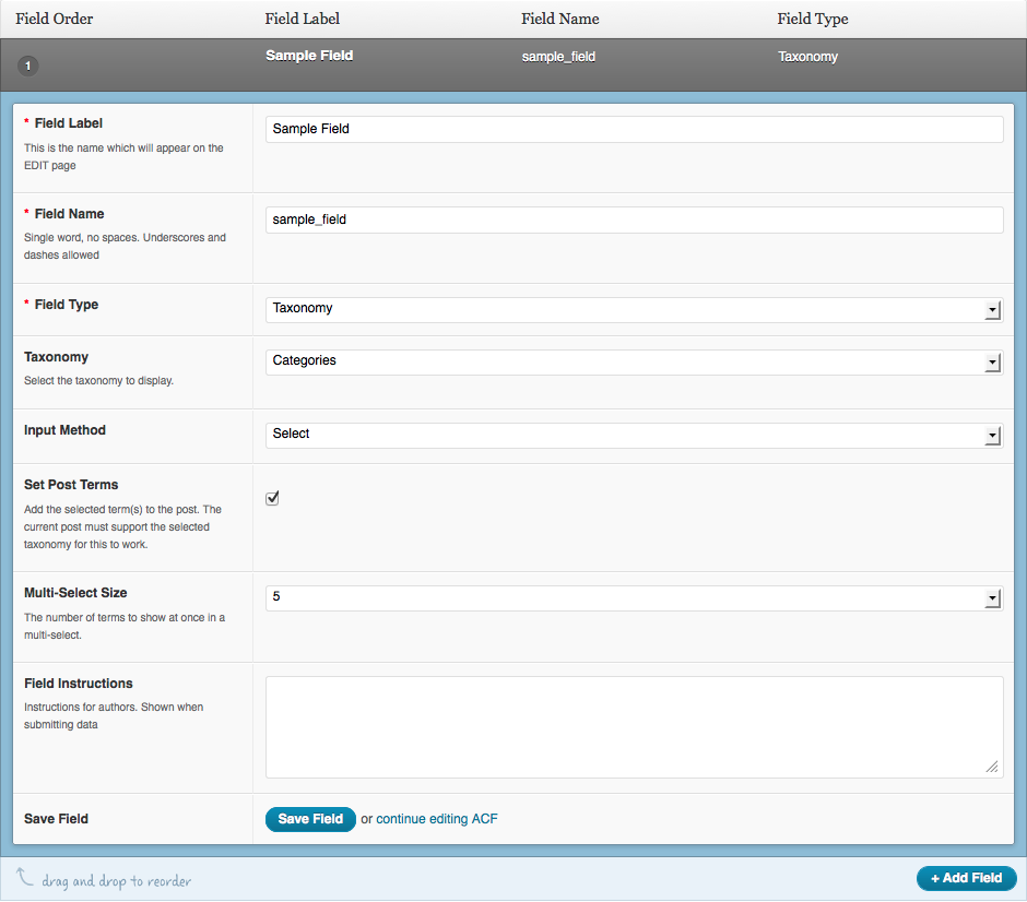
@AlexGStapleton do you know any case where we need a dialog box that size for a widget? I tested the majority of the widgets in the bundle package and we have so much empty spaces in all of them. If you look at my first screenshot, do you think having that much empty space is reasonable? also the full width fields has been widely used in other plugins UI, for example visual composer: or Advanced Custom Field: |
|
I'm unsure. Our Widgets Bundle is actually also a framework so any plugin can make use of it as a base. As such, restricting it to a certain size isn't something that should really be done as it may limit certain widgets. What widgets I don't know, but it would be better not to put an artificial limit in place regardless. I'm okay with the idea of making the fields full width now. I'm going to forward this thread to Greg. |
|
@AlexGStapleton I am glad that you like the idea of full width fields. But it only works if we reduce the size of the dialog box, else, it would be a terrible idea. Imagine having full width in the first screenshot, I don't think user experience-wise it would work if we are not going to reduce the size of the dialog box. In both examples where fields are full width, the dialog is small and not full screen. |
|
I agree that for certain widgets, the excess white space isn't all that attractive. The main reason we made the widget dialogs bigger was to give space for things like nested repeater fields with TinyMCE fields. In this case, the more horizontal space, the better. One solution might be to add an extra button to the menu bar (next to the left and right navigation arrows), that allows the user to collapse the widget dialog into a narrower fixed-width. |
|
@gregpriday yes, that is an option too. |


When you try to add an element, the UI covers the entire screen with lots of empty spaces.
For example look at this screenshot:
there are empty spaces which could be removed by simply making the box smaller.
can we resize the edit box to be smaller?
The text was updated successfully, but these errors were encountered: