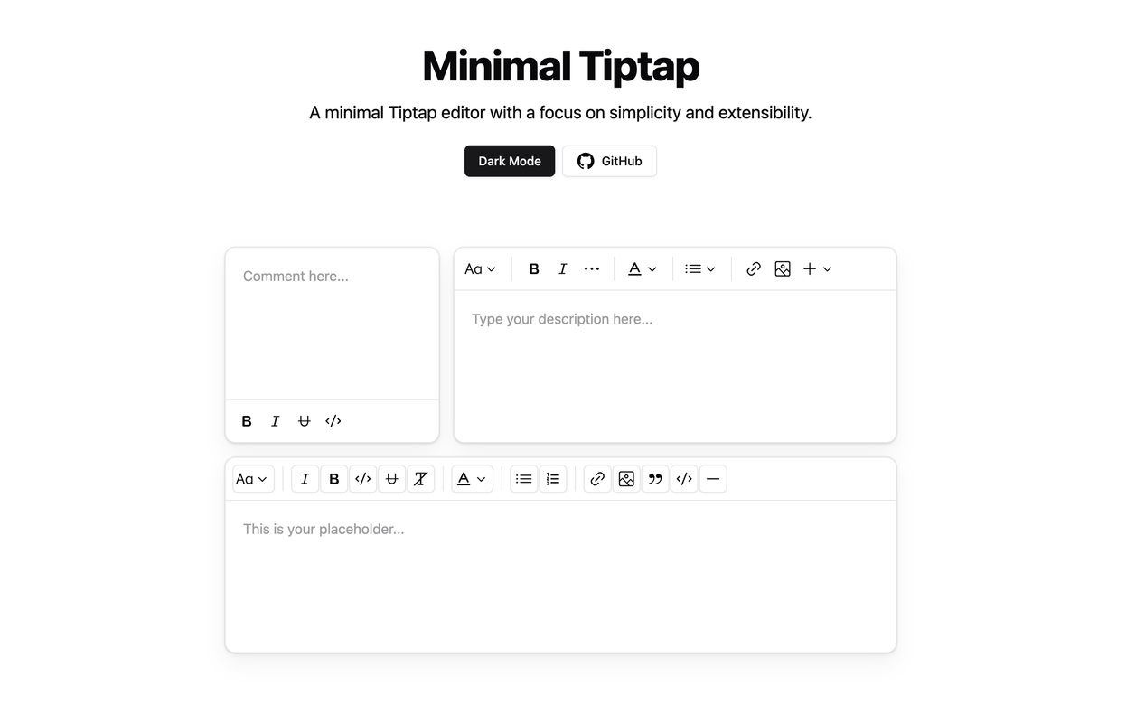
The Minimal Tiptap Editor is a lightweight, customizable rich text editor component designed for integration with Shadcn UI. It provides an intuitive interface for text formatting and editing while maintaining excellent performance.
- Install the required dependencies:
npm install @tiptap/extension-code-block-lowlight lowlight react-medium-image-zoom @tiptap/extension-color @tiptap/extension-heading @tiptap/extension-horizontal-rule @tiptap/extension-image @tiptap/extension-link @tiptap/extension-placeholder @tiptap/extension-text-style @tiptap/extension-typography @tiptap/pm @tiptap/react @tiptap/starter-kit @tiptap/extension-underline- Configure the
TooltipProvider:
Add the TooltipProvider to your application's root component (e.g., App.tsx or main.tsx):
import { TooltipProvider } from '@/components/ui/tooltip'

export const App = () => {
  return (
    <TooltipProvider>
      {/* Application components */}
      <YourComponent />
    </TooltipProvider>
  )
}The following Shadcn UI components are required:
- Copy the
minimal-tiptapdirectory into your project - Implement the component in your React application:
import { useState } from 'react'
import { Content } from '@tiptap/react'
import { MinimalTiptapEditor } from './minimal-tiptap'

export const App = () => {
  const [value, setValue] = useState<Content>('')

  return (
    <MinimalTiptapEditor
      value={value}
      onChange={setValue}
      className="w-full"
      editorContentClassName="p-5"
      output="html"
      placeholder="Enter your description..."
      autofocus={true}
      editable={true}
      editorClassName="focus:outline-none"
    />
  )
}The editor accepts all standard Tiptap editor props, plus these additional configuration options:
| Prop | Type | Default | Description |
|---|---|---|---|
value |
string | - | Initial editor content |
onChange |
function | - | Content change event handler |
editorContentClassName |
string | - | CSS class for the editor content container |
output |
'html' | 'json' | 'text' | 'html' | Desired output format |
placeholder |
string | - | Editor placeholder text |
editorClassName |
string | - | CSS class for the editor container |
throttleDelay |
number | 0 | Update throttling delay in milliseconds |
Configure the Image extension with custom options:
Note: The
uploadFnmust return the uploaded image URL. If nouploadFnis specified, enable theallowBase64option.
Image.configure({
  allowedMimeTypes: ['image/jpeg', 'image/png', 'image/gif'],
  onImageRemove: handleImageRemove,
  maxFileSize: 5 * 1024 * 1024, // 5MB
  uploadFn: customImageUploader,
  onActionSuccess: handleActionSuccess,
  onActionError: handleActionError,
  onValidationError: handleValidationError
})Implement a custom upload handler:
const customImageUploader = async (file: File, editor: Editor) => {
  // Implement upload logic
  // Return the uploaded image URL
  return 'https://example.com/uploaded-image.jpg'
}

Image.configure({
  uploadFn: customImageUploader
})Implement comprehensive error handling:
Image.configure({
  onActionError: (error, props) => {
    console.error('Image upload failed:', error, props)
    // Implement user notification
  },
  onValidationError: errors => {
    console.error('Image validation failed:', errors)
    // Display validation feedback
  }
})Customize toolbar sections using various configuration options:
<SectionOne editor={editor} activeLevels={[1, 2, 3, 4, 5, 6]} variant="outline" />

<SectionTwo
  editor={editor}
  activeActions={['bold', 'italic', 'strikethrough', 'code', 'clearFormatting']}
  mainActionCount={2}
/>

<SectionFour editor={editor} activeActions={['orderedList', 'bulletList']} mainActionCount={0} />

<SectionFive editor={editor} activeActions={['codeBlock', 'blockquote', 'horizontalRule']} mainActionCount={0} />
To prevent Dropdown Menu Trigger focus after selection:
onCloseAutoFocus={event => event.preventDefault()}- Automatic formatting removal when pressing Enter or creating new blocks
- Performance optimization through configurable
shouldRerenderOnTransaction - Comprehensive image handling with upload support
- Customizable toolbar with flexible section configuration
This project is licensed under the MIT License. See the LICENSE file for details.