-
Notifications
You must be signed in to change notification settings - Fork 4.2k
New issue
Have a question about this project? Sign up for a free GitHub account to open an issue and contact its maintainers and the community.
By clicking “Sign up for GitHub”, you agree to our terms of service and privacy statement. We’ll occasionally send you account related emails.
Already on GitHub? Sign in to your account
Make drag handle visible on hover in nested #10063
Conversation
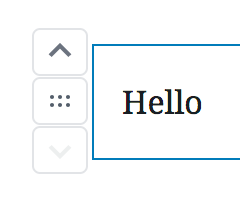
In nested contexts, the drag handle doesn't have a background on hover like the up/down arrows. This PR refactors things a bit and fixes it up.
|
Thanks, Joen — this is looking good, but I wonder if we can adjust the spacing a little bit before merging? Right now the top of the drag handle's top border overlaps with the bottom border of the up arrow, and the bottom border bumps right up against the top of the down arrow. It looks a little imbalanced: It'd be great if there was a 1px border in between all: |
|
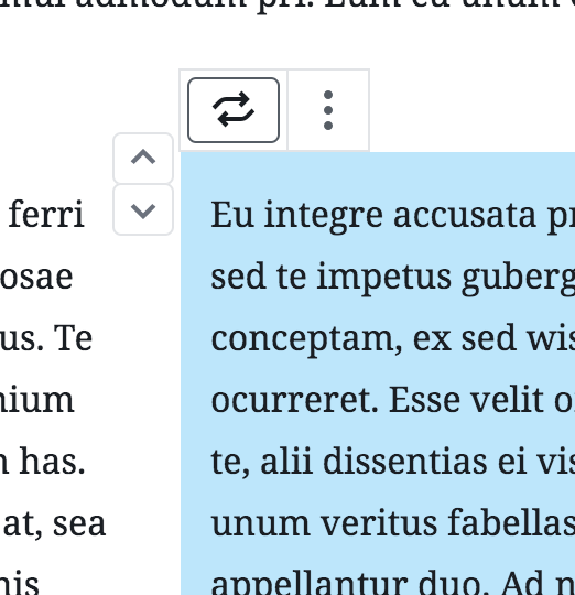
It frustrates me a little bit that we want to target nested blocks separately. I mean I understand why, I just feel like there has to be a middle road that works in both contexts and feels a little less kludgy. One concept is something like this that treats the entire mover as single area, like so: (Note that in the screenshot I did also align the top edge of the movers and the block canvas. I have a lot of reasons why I think that's right, which I spent some time typing up and then decided not to share them so as not to derail my main point about nested/non-nested consistency. So ignore the vertical positioning, and just pay attention to the single border rather than individual button borders. 😄) |
|
Great catches. I addressed the feedback: The borders are stacked rather than space between, I have a slight preference for that. It also works when you multiselect in a nested context: The meta issue here, as beautifully noted and addressed by @chrisvanpatten, is that this isn't ideal. I totally agree, but thankfully I feel we've made strides by moving the ellipsis to the block toolbar and simplified things like the drag handle, at least it's getting there. I also happen to prefer the mockup Chris provided, in fact I tried doing something like that, but the current setup doesn't easily lend itself to this design. That doesn't mean it shouldn't be done, just that I couldn't do it fast, and I'd rather have small iterative improvements in the mean time. |
|
@jasmussen agreed wholeheartedly. I have a WIP branch with several other tweaks that I can push up but that shouldn’t block this. I say 🚢 it! |
There was a problem hiding this comment.
Choose a reason for hiding this comment
The reason will be displayed to describe this comment to others. Learn more.
🚢 Thanks, @jasmussen!
I also like that exploration by @chrisvanpatten — it'd be great to see something like that happen in the future.


In nested contexts, the drag handle doesn't have a background on hover like the up/down arrows. This PR refactors things a bit and fixes it up.
Before:
After: