-
Notifications
You must be signed in to change notification settings - Fork 4.2k
New issue
Have a question about this project? Sign up for a free GitHub account to open an issue and contact its maintainers and the community.
By clicking “Sign up for GitHub”, you agree to our terms of service and privacy statement. We’ll occasionally send you account related emails.
Already on GitHub? Sign in to your account
Multi-select: Polish further, try new style. #19094
Conversation
This PR is an alternative to #19088 and only one should be merged.

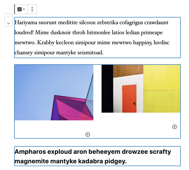
This approach taken in this PR is not to paint a background, but to move towards the selction model that apps like Figma leverage, which is to draw a thick border around selected blocks. It makes sense in that you're no longer selecting text, you're selecting blocks.
|
I just spent some testing both PRs of this. As noted in the other issue, my first instinct wasn't to this one. My perspective changed on testing more dense layouts: As you can see above, that's a quite intense interface created, whereas in this PR you have: I might go a little further considering a deeper border, but as the layout gets more complex this version should allow you to see what is going on more than a blanket blue highlight. |
|
Perhaps the deeper blue suggested in the g2 UI would provide some vibrancy that in addition to the border provides visibility? |
That's a good point as well.
I am excited to refine the block toolbar, but I do worry that if we do some aspects piecemeal we'll end up with an interim that looks kind of messy and unfocused. I think we should remove that border when we look at the borders and toolbar together, the chief driver being the improvement of focus rectangles. I think we can probably keep #19088 open and if you agree we can merge this to master and try it out? It might even be good to keep handy in case we make a plugin point release. |
There was a problem hiding this comment.
Choose a reason for hiding this comment
The reason will be displayed to describe this comment to others. Learn more.
As these are style changes, approving.
|
Thanks for this PR. I'm a bit surprised that there's no more text selection when you end the selection. That's fine I guess, but we will need it again in some cases when we have partial multi block selection. Also, since this PR now hides the selection at the end, there's no need to run the code that sets it. |
|
How does this look on dark backgrounds? Has it been tested? Why not leave the text selection for extra clarity (it's really visible, works on all kinds of backgrounds)? |


This PR is an alternative to #19088 and only one should be merged.
This approach taken in this PR is not to paint a background, but to move towards the selction model that apps like Figma leverage, which is to draw a thick border around selected blocks. It makes sense in that you're no longer selecting text, you're selecting blocks.
A benefit of this approach is that it shows the blocks true footprint, not the padded one that has spacing around it that doesn't exist on the frontend.
GIF:
Another benefit is that this works well for full-wide blocks: