Parallel Categories trace type for multi dimensional categorical data #1
Conversation
|
(Adding @nicolaskruchten as well!) |
|
Thanks very much for the PR @jonmmease 🎉 🚀 🏆 Unfortunately, i'm a little backed up in my own TODO list, so I probably won't have time to look at your work until v1.40.0 is out in ~ 2 weeks time. |
|
Omg! So cool :) ... more professional feedback on Monday ;) |
|
Thanks @etpinard and @nicolaskruchten , I know reviewing a new trace type is no small task! |
|
Very nice work @jonmmease! Looking at what you've got here, I'm happy to start this way (as a separate trace type). At some point we still may want to fold this into I'll look at the code in a moment, but a few comments on the display and behavior:
|
src/components/fx/hover.js
Outdated
| @@ -153,6 +153,82 @@ exports.loneHover = function loneHover(hoverItem, opts) { | |||
| return hoverLabel.node(); | |||
| }; | |||
|
|
|||
| // TODO: replace loneHover? | |||
There was a problem hiding this comment.
Interesting... can you say more? Is this just an extension of loneHover to support multiple labels or does it add something else? I only see one label at a time when I play with parcats.
There was a problem hiding this comment.
At one point I had added a mode that would display a separate tooltip for each color of the category you hover over. It got pretty unwieldy and I reverted back to loneHover. I'll remove this customHover function.
There was a problem hiding this comment.
Unwieldy in the code or on screen? We have some upcoming sankey enhancements that may call for a very similar multi-label hover effect, though the details still need to be worked out. But if the code is clean and it was just not looking good in practice, it still may be worth keeping this around.
There was a problem hiding this comment.
On the screen. I think the implementation worked well enough. I'll look over it again and write a better explanation of what it does 🙂
src/traces/parcats/attributes.js
Outdated
| var scatterMarkerAttrs = scatterAttrs.marker; | ||
| var colorbarAttrs = require('../../components/colorbar/attributes'); | ||
|
|
||
| var marker = extendFlat({ |
There was a problem hiding this comment.
This seems more like line to me, and that would also be consistent with parcoords.
There was a problem hiding this comment.
Sounds good. I think I started out calling it marker because I thought it might be nice to style the outline of the paths, and to call this line. But I don't think that really makes sense anymore. I'll change in to line.
src/traces/parcats/attributes.js
Outdated
|
|
||
| var marker = extendFlat({ | ||
| editType: 'calc' | ||
| }, colorAttributes('marker', {editType: 'calc'}), |
There was a problem hiding this comment.
If we at some point want to support selections similar to how parcoords works, perhaps we want Viridis here too? How well does this work with continuous color values, does it attempt to sort in color order or does it just keep distinct values together? Also I don't see a mock with a colorbar and in your brushing example it looks like you just use two distinct colors - does it support providing an array of color strings or just numeric values? Actually I'm not sure if parcoords supports strings...
Anyway if you're just using color as a marker of selected/deselected it seems a bit hacky to have to create a colorscale with the two colors you want. Perhaps instead (or in addition) we should use selectedpoints and add selected/unselected styling, with the default for unselected being a grey similar to parcoords and your brushing example.
There was a problem hiding this comment.
A path (thick line) is created for each unique combination of the dimension categories and raw color (the value as specified in marker.color). The relative height of the path is determined by the number of observations the path represents.
The display color of the path is computed based on the path's unique raw color value. If no colorscale is present, then the raw color is the display color (So yes, you can pass an array of color strings to marker.color). If a colorscale is present and the raw color is numeric then it is mapped to a display color using the usual scaling process.
So continuous colorscales are fine as long as the numeric color values are somewhat discrete. If there are 1000 unique values in the color array, then the diagram will sort of degenerate into a bunch of tiny paths. In my own analysis work I've either used a categorical colormap with an integer color array (this is the brushing scenario), or used a continuous colormap and manually discretized the color values. In both cases I would generally stay under 10 discrete colors.
The selection metaphor here is interesting. So far I'm just emitting the plotly_click and hover events and then executing selection like logic (highlighting clicked paths) from the outside.
src/traces/parcats/attributes.js
Outdated
| shape: { | ||
| valType: 'enumerated', | ||
| values: ['straight', 'curved'], | ||
| dflt: 'curved', |
There was a problem hiding this comment.
Perhaps to match scatter we should have 'linear' and 'spline'? Though this curve is really a different thing, as it's constrained to be horizontal at both ends - an option we've discussed adding to scatter lines in fact - (related plotly#993 talks about monotone splines, which is yet another variant) ... but if we can decide on a name this should have in scatter, it would be good to use the same name here. What about 'hspline' for "spline with horizontal ends" (and we'd also add 'vspline' to scatter, though it wouldn't be added here unless we make a vertical orientation option for this trace type.)
Also, I wonder if the default should be 'linear'? Curved matches sankey, but straight matches parcoords and I think it actually makes connections a bit easier to follow - which may be why the existing implementations you showed use straight connections.
The other visual changes you made vs the existing implementations, which seem to come from sankey - a bar of color instead of a black line, a halo around the category labels - are clear improvements!
There was a problem hiding this comment.
'linear' + 'hspline' with 'linear' as default sounds good to me!
src/traces/parcats/attributes.js
Outdated
| }); | ||
|
|
||
| module.exports = { | ||
| domain: { |
There was a problem hiding this comment.
... and correespondingly handleDomainDefaults in the defaults step. The reason for this, aside from 🌴, is to support layout.grid plotly#2399
src/traces/parcats/attributes.js
Outdated
| editType: 'calc' | ||
| }, | ||
|
|
||
| tooltip: { |
There was a problem hiding this comment.
this should be handled by hoverinfo
There was a problem hiding this comment.
Sounds good. I'll work through the comparison with Sankey, but I'm thinking the flaglist would be a combination of 'count' and/or 'probability', or 'none' to disable it all together.
There was a problem hiding this comment.
Done in 3680084
tooltip is gone and hoverinfo is added. As usual, hoverinfo can be one of skip, none, or all. Or a combination of count and probability.
Having the skip hoverinfo value also removed the need for the none hovermode enumeration value.
src/traces/parcats/attributes.js
Outdated
| editType: 'calc', | ||
| description: 'The shown name of the dimension.' | ||
| }, | ||
| catDisplayInds: { |
There was a problem hiding this comment.
(here and below: lowercase please)
I'm thinking categoryorder and categoryarray like we have for cartesian axes where you could initially specify one of the sort orders 'trace' | 'category ascending' | 'category descending' for categoryorder but as soon as the user moves things around it would switch to 'array' and create a categoryarray?
I guess catValues and catLabels allows you to use different data for values than you display... presumably the typical use here would be integer values and string labels? Makes sense, I'd just spell out the names completely: categoryvalues and categorylabels.
There was a problem hiding this comment.
Ah yes, this is a nice parallel with Cartesian axes. To summarize:
catValuesandcatDisplayIndswill be replaced bycategoryarraycategoryorderwill be introduced to control whether ordering is based oncategoryarray, thetrace, or the ascending/descending by category value. I believe the current default behavior is equivalent totrace, and having the ascending and descending modes will be nice.categorylabelswill be introduced to control the category label displayed. This will be an array the same length ascategoryarray, and will only have an effect whencategoryorderisarray. Additionally, to keep things consistent, thecategorylabelsarray will need to be reordered along withcategoryarraywhen the user drags to reorder categories.
src/traces/parcats/attributes.js
Outdated
| 'will be truncated). Each value must an element of `catValues`.' | ||
| ].join(' ') | ||
| }, | ||
| displayInd: { |
There was a problem hiding this comment.
Again I'd spell out displayindex. Also reminds me we need a visible attribute per dimension.
There was a problem hiding this comment.
Sure. Do you prefer all lowercase for the internal JavaScript object properties as well? Right now all of these are in camelCase, but I can change that.
There was a problem hiding this comment.
Just use lowercase for attribute names in the figure JSON (data and layout). In the code, camelCase is preferred.
There was a problem hiding this comment.
displayindex done in a34dafa
Still need to add dimension.visible attribute
src/traces/parcats/colorbar.js
Outdated
| var drawColorbar = require('../../components/colorbar/draw'); | ||
|
|
||
|
|
||
| module.exports = function colorbar(gd, cd) { |
There was a problem hiding this comment.
This was simplified recently. Take a look at plotly@fa86147
There was a problem hiding this comment.
Done in 71e212b
I also added a mock that shows the colorbar. But the colorbar doesn't seem to follow the domain of the trace. Is this consistent with other trace types?

src/traces/parcats/constants.js
Outdated
|
|
||
|
|
||
| module.exports = { | ||
| maxDimensionCount: 12, |
There was a problem hiding this comment.
Is this a performance limit, a screen-space limit, a code structure limit, or... ?
There was a problem hiding this comment.
It's not performance or code structure. I think it was a conservative estimate based on plot width. The rectangle width plus space for a single letter label over 12 dimensions, plus the left and right margins, comes to ~400 pixels.
There was a problem hiding this comment.
I'd remove this limitation then. parcoords has a hard limit at 60 dimensions based on the data structures we create on the GPU. We don't want to restrict plots just because we think they're not going to look good, or fit in a normal amount of space. Someone will surely want to fill up their dual 5K displays with these at some point ;)
src/traces/parcats/defaults.js
Outdated
|
|
||
| if(!Lib.isPlainObject(dimensionIn)) { | ||
| continue; | ||
| } |
There was a problem hiding this comment.
Templates plotly#2761 imposed a few new constraints on container arrays - in particular the need for a visible attribute instead of skipping faulty entries, but it DRY's up this pattern too. See for example the changes to parcoords/defaults there.
|
This is really neat, and the cross-filtering example is very compelling. Even without the crossfiltering the standalone interaction in the GIF you posted looks really useful from an exploration perspective! +1 from me for inclusion into plotly.js in principle :) Would be great to see some examples in the documentation when it comes out for how to easily do parcoors+parcats in one plot with the filtering like you have here :) |
|
Thanks for your thoughts and detailed feedback @alexcjohnson and @nicolaskruchten! I'm super excited to work on getting this in 🙂 I'll do a deep pass through your comments and push an update in a couple of days. |
|
Could this be used with continuous dimensions as well with some sort of controllable auto-binning behaviour on those dimensions? |
|
@nicolaskruchten Yeah. What I've found to work well from the Python side is to run continuous columns through This raises a really interesting question. What's the best way to discretize a continuous dimension so as to make this diagram as informative as possible? To be informative, you want the observations in each interval to tend to behave similarly across the rest of the dimensions. And you want adjacent intervals to tend to behave differently from each other. One technique I've played around with works pretty well is Minimum Description Length Principle (MDLP) discretization. Paper: https://trs.jpl.nasa.gov/handle/2014/35171, a Python implementation: https://github.com/hlin117/mdlp-discretization. |
|
I could see multiple binning modes:
|
|
As a separate comment/question: could/do we support a vertical layout where the boxes are laid out horizontally? |
What would the 'other' category mean in this case?
To this point I've not put any thought/effort into supporting a vertical layout. So I'm not sure what it would take to do so. Do you have any use-cases in mind where you think this would be helpful? |
To me, vertical layout implies hierarchy - and it's interesting to think about using this chart type for hierarchical data, but it's not the main focus here. Lets keep it horizontal-only in the first iteration. |
If you enumerate bins and you have data that doesn't fit into any of the bins :)
I'm not sure the Titanic example implies hierarchy to me... What I like about a vertical layout is that the category boxes are horizontal so rendering long-ish category names will look good as they could live in or along the boxes and be readable without head-rotation :) |
Exactly, that example is not hierarchical but when it’s laid out vertically my instinct is to try and interpret it that way and look for patterns that aren’t there. Maybe I’m alone in that, but to me that makes vertical seem less appropriate. I see your point about label length though, and I’m not averse to eventually adding it. For now I guess the only implication is if there are attribute names and values that imply an orientation (I haven’t looked) we should try to find alternatives that don’t. |
|
One trouble with vertical orientation, though, is that only prominent categories can have long names. In the titanic dataset, for example, if there was only one observation in both "First Class" and "Third Class" then the labels would overlap (Unless you add the kind of label placement magic that the What I like about the horizontal orientation is that the max label length is determined by the number of dimensions and size of the plot, not the dataset itself. So as long as everything fits using your initial data set, future data sets will look good also. |
Added colorscale mock
(property isn't wired up properly yet)
|
I just added a mock that demonstrates the The basic idea here is that when you hover on a category, only the paths of a single color are highlighted. What's really useful about this is that the tooltip can then display the absolute probability of the paths of that color that pass through a given category. You can also display the conditional probabilities (Probability of blue given category A, probability of category A given blue).
Does |

More consistent with other traces, and now it's possible to display
only probabilities, only counts, both, none (with hover effects),
or skip (not hover effects).
There are three arrangement modes:
 - `perpendicular` (default): categories only drag vertically,
    dimension labels drag horizontally.
 - `freeform`: category labels can drag vertically and horizontally
    (in which case they pull the dimension along with them). Here
    dragging a category can reorder the categories and dimensions.
 - `fixed`: dragging of dimensions and categories is disabled.
|
@alexcjohnson
|
Not working yet, just a checkpoint
Mocks updated, but not tests yet.
|
@alexcjohnson
If you notice the hover label on Now that there are multiple hovermodes and configurable hoverinfo I do like this mode as an option. |

|
Thanks again for looking this over @alexcjohnson , I think I've worked through all of the recommendation from your first pass. Until you or @etpinard have a chance to take another look, I'm going to work on adding font configuration for the dimension and category labels. Font configuration is the last new feature that I have in mind at this point (for the initial version). After that I'll be working on filling out the test suite and improving the attribute descriptions. |
to the control font of dimension labels and category labels respectively
|
Font support added for dimension labels ( |
Makes the hoverlabel shifting logic more noticeable and shows off
the `counts` attribute
Now there are tests for 'freeform', 'perpendicular', and 'fixed'
arrangements for dragging the dimension label and category rectangle.
|
Superseded by plotly#2963 |
* Fix bug in scattergl plot
* Added tests for scattergl plot update
Superseded by plotly#2963
@alexcjohnson @etpinard @monfera @chriddyp @jackparmer
Introduction
This PR is a proposal and an implementation of a new trace type for the interactive exploration of multi-dimensional categorical data sets. My working name for the trace is "Parallel Categories" or
parcatsfor short.The concept of this trace has been discussed previously in the following plotly.js issues:
parcoordsandsankeyplotly/plotly.js#2229I also briefly showed a prototype of this diagram to @chriddyp over screenshare several months ago.
Related work
The closest prior art to the Parallel Categories Diagram is the Parallel Sets Diagram by Robert Kosara and Caroline Ziemkiewicz.
Parallel Sets implementations / descriptions
Here are a collection of existing implementations / descriptions of the Parallel Sets Diagram
Parallel Sets Java Program
https://eagereyes.org/parallel-sets
This is a stand-alone Java program by Kosara that implements a Parallel Sets Diagram
Parallel Sets from the DataViz catalog
https://datavizcatalogue.com/methods/parallel_sets.html
D3 implementation of Parallel Sets
https://www.jasondavies.com/parallel-sets/
What's different about the Parallel Categories Diagram?
The primary difference between this Parallel Categories Diagram (parcats from here on) and the Parallel Sets Diagram (parsets from each on) is that the parcats diagram supports a more flexible path coloring scheme.
In all of the examples of parsets diagrams that I have found, the colors of the paths correspond to states in the left-most (or top-most) dimension. In contrast, for the parcats diagram, color may correspond to a column in the dataset that may or may not be present as a dimensions in the diagram.
This, admittedly modest, extension has several advantages. Path colors may be set using a numeric array and a color map just like many other plotly.js trace types (scatter, parcoords, etc.). This makes it possible to use the parcats diagram combined with other traces in brushing/crossfiltering configurations.
Dragging and Brushing example
Here is an example of visualizing a 5-dimensional data set with two continuous dimensions and 3 categorical dimensions. This is accomplished by displaying the two continuous dimensions in a 2D scatter plot and the 3 categorical dimensions using the parcats diagram.
I created this example using a branch of plotly.py version 3 built against this branch of plotly.js.
First I show the drag interactions supported by the diagram. Categories (the rectangles) and dimensions labels (dimensions are the columns of rectangles) can be dragged to reorder categories and dimensions. Upon release, the diagram animates to a relaxed state with equal spacing between dimensions and categories.
Selection events in the scatter plot are use to update the colors of both the selected points in the scatter plot, and the corresponding paths in the parcats diagram. Similarly, click events on categories and paths in the parcats diagram are used to update the colors in both diagrams.
As far as I'm aware, this is the only visualization of multi-dimensional categorical data that supports this kind of two-way data brushing. And, combined with plotly.py version 3, it is certainly the only visualization of this type that would be easily accessible to Python users.
Color bundling
There are two modes for how the colors of paths are arranged.
In the example above, color is not considered when sorting the paths. This is desirable in a brushing scenario so that the paths remain stable as the colors change during interactions. This behavior is specified by setting the
bundlecolorsproperty tofalse.Setting the
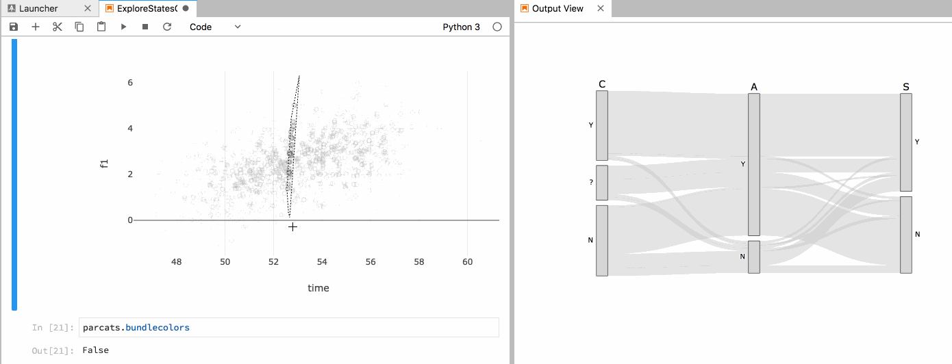
bundlecolorsproperty totruecauses paths with like colors to be bundled together as they pass through each category. This results in a cleaner looking diagram and is preferable in cases where the positions of paths do not need to remain stable as colors change.For example:
Mocks
Several simple mocks have been added as a part of the current test suite.
parcats_basicparcats_bundledparcats_unbundledAPI notes
I tried to model the API as closely as possible after existing trace conventions. There is a top-level
dimensionsproperty withlabelandvaluessub-properties just as with theparcatstrace. Path colors/colorscales are specified under adimension.markerparent property.Alternative approach
In the issues cited at the beginning of this PR there was some discussion on the possibility of adding categorical support to the existing Parallel Coordinates Diagram. This diagram was already well under development for our internal needs at the time of these discussions, so I did not pursue this approach.
TODO
Some items that I know still need to be done
Request for comments
So the top-level question for the plotly.js team is, are you all interested in having this diagram be part of plotly.js? It's not the most common use-case, but I think it would be another differentiating feature for the plotly ecosystem.
If you all are interested, I have internal funding to put a bunch more time into this through September. And if we can get it merged in during that time, I can continue helping out with basic maintenance after that.
Let me know what you think!