-
Notifications
You must be signed in to change notification settings - Fork 8.4k
New issue
Have a question about this project? Sign up for a free GitHub account to open an issue and contact its maintainers and the community.
By clicking “Sign up for GitHub”, you agree to our terms of service and privacy statement. We’ll occasionally send you account related emails.
Already on GitHub? Sign in to your account
Update the shape of our custom NewTab button to match MUX's TabView button #6766
Conversation
There was a problem hiding this comment.
Choose a reason for hiding this comment
The reason will be displayed to describe this comment to others. Learn more.
Thanks for this! I appreciate your attention to detail!
There was a problem hiding this comment.
Choose a reason for hiding this comment
The reason will be displayed to describe this comment to others. Learn more.
This is beautiful, thanks!
|
Hello @zadjii-msft! Because this pull request has the p.s. you can customize the way I help with merging this pull request, such as holding this pull request until a specific person approves. Simply @mention me (
|
Update colors of our custom NewTab button to match MUX's TabView button

MUX has a NewTab button, but Terminal uses a homemade lookalike.  The
version in Terminal doesn't use the same brush color resources as MUX's
button, so it looks very slightly different.  This PR updates Terminal's
button to use the exact same colors that MUX uses.  I literally copied
these brush names out of MUX source code.

## References
This is the color version of the layout fix #6766
This is a prerequisite for fixing #5360

## Detailed Description of the Pull Request / Additional comments
The real reason that this matters is that once you flip on
`ApplicationHighContrastAdjustment::None`, the existing colors will not
work at all.  The existing brushes are themed to black foreground on a
black background when High Contrast (HC) Black theme is enabled.  The
only thing that's saving you is
`ApplicationHighContrastAdjustment::Auto` is automatically backplating
the glyphs on the buttons, which (by design) hides the fact that the
colors are poor.  The backplates are those ugly squares inside the
buttons on the HC themes.

Before I can push a PR that disables automatic backplating (set
`ApplicationHighContrastAdjustment` to `None`), we'll need to select
better brushes that work in HC mode.  MUX has already selected brushes
that work great in all modes, so it just makes sense to use their
brushes.

The one very subtle difference here is that, for non-HC themes, the
glyph's foreground has a bit more contrast when the button is in
hovered/pressed states.  Again this slight difference hardly matters
now, but using the correct brushes will become critical when we try to
remove the HC backplating.

Closes #6812
…utton (#6766) The MUX TabView control has a uniquely-shaped [+] button. TerminalApp doesn't use it: instead, it has a SplitView button that is styled to look like MUX's official button. However, it doesn't get the button's shape right. This PR updates TerminalApp's custom button to look more like MUX's. The difference is that MUX only rounds the top two corners, and it uses a bigger radius. Without matching MUX's radius, the upper-left corner of the button makes an awkward asymmetric divot with the abutting tab. There's also a spot in the lower-left corner that just looks like someone accidentally spilled a few pixels on the floor. Current appearance before this PR:  New appearance with this PR:  Most important deltas highlighted with red circles:  Note that this PR does *not* attempt to fix the colors. The colors are also just slightly different from what MUX uses. I'll save that for a separate PR, since all those screenshots would clutter this up this PR. (cherry picked from commit d350a89)
Update colors of our custom NewTab button to match MUX's TabView button

MUX has a NewTab button, but Terminal uses a homemade lookalike.  The
version in Terminal doesn't use the same brush color resources as MUX's
button, so it looks very slightly different.  This PR updates Terminal's
button to use the exact same colors that MUX uses.  I literally copied
these brush names out of MUX source code.

## References
This is the color version of the layout fix #6766
This is a prerequisite for fixing #5360

## Detailed Description of the Pull Request / Additional comments
The real reason that this matters is that once you flip on
`ApplicationHighContrastAdjustment::None`, the existing colors will not
work at all.  The existing brushes are themed to black foreground on a
black background when High Contrast (HC) Black theme is enabled.  The
only thing that's saving you is
`ApplicationHighContrastAdjustment::Auto` is automatically backplating
the glyphs on the buttons, which (by design) hides the fact that the
colors are poor.  The backplates are those ugly squares inside the
buttons on the HC themes.

Before I can push a PR that disables automatic backplating (set
`ApplicationHighContrastAdjustment` to `None`), we'll need to select
better brushes that work in HC mode.  MUX has already selected brushes
that work great in all modes, so it just makes sense to use their
brushes.

The one very subtle difference here is that, for non-HC themes, the
glyph's foreground has a bit more contrast when the button is in
hovered/pressed states.  Again this slight difference hardly matters
now, but using the correct brushes will become critical when we try to
remove the HC backplating.

Closes #6812

(cherry picked from commit 4faa104)
|
🎉This issue was addressed in #6812, which has now been successfully released as Handy links: |
|
🎉 Handy links: |
|
🎉This issue was addressed in #6812, which has now been successfully released as Handy links: |
|
🎉 Handy links: |
|
🎉This issue was addressed in #6812, which has now been successfully released as Handy links: |
|
🎉 Handy links: |
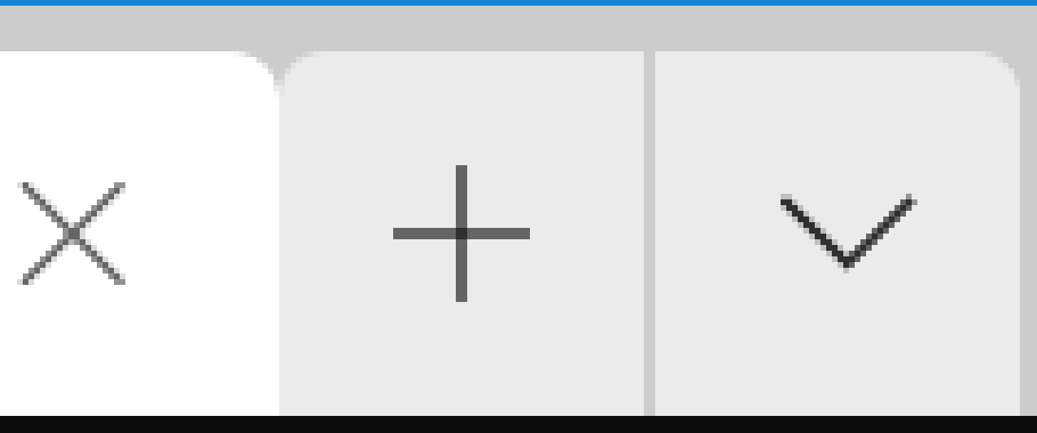
The MUX TabView control has a uniquely-shaped [+] button. TerminalApp
doesn't use it: instead, it has a SplitView button that is styled to
look like MUX's official button. However, it doesn't get the button's
shape right. This PR updates TerminalApp's custom button to look more
like MUX's.
The difference is that MUX only rounds the top two corners, and it uses
a bigger radius. Without matching MUX's radius, the upper-left corner
of the button makes an awkward asymmetric divot with the abutting tab.
There's also a spot in the lower-left corner that just looks like
someone accidentally spilled a few pixels on the floor.
Current appearance before this PR:

New appearance with this PR:

Most important deltas highlighted with red circles:

Note that this PR does not attempt to fix the colors. The colors are
also just slightly different from what MUX uses. I'll save that for a
separate PR, since all those screenshots would clutter this up this PR.