-
-
Notifications
You must be signed in to change notification settings - Fork 1.3k
New issue
Have a question about this project? Sign up for a free GitHub account to open an issue and contact its maintainers and the community.
By clicking “Sign up for GitHub”, you agree to our terms of service and privacy statement. We’ll occasionally send you account related emails.
Already on GitHub? Sign in to your account
Number with currency widget #1793
Conversation
|
😍 👍 |
|
I like this a lot. I'm assuming we'd use the same thing in the settings where you set the master currency for each store? |
This probably only makes sense when entering an amount. |
There was a problem hiding this comment.
Choose a reason for hiding this comment
The reason will be displayed to describe this comment to others. Learn more.
Now that we have components inheriting styles from $input-color (instead of catching the old solidus styles) we should probably replace that boostrap default with the current solidus admin color
# backend/_bootstrap_custom.scss
-$input-color:                    $gray !default;
+$input-color: $brand-primary;| background: url("data:image/svg+xml;utf8,<svg xmlns='http://www.w3.org/2000/svg' width='1024' height='640'><path d='M1017 68L541 626q-11 12-26 12t-26-12L13 68Q-3 49 6 24.5T39 0h952q24 0 33 24.5t-7 43.5z'></path></svg>") 90%/12px 6px no-repeat; | ||
|
|
||
| font-family: inherit; | ||
| color: inherit; |
There was a problem hiding this comment.
Choose a reason for hiding this comment
The reason will be displayed to describe this comment to others. Learn more.
Is there a reason for these inherits? That would be the default and it's also in our reset.
| -moz-appearance:none; | ||
| appearance:none; | ||
|
|
||
| background: url("data:image/svg+xml;utf8,<svg xmlns='http://www.w3.org/2000/svg' width='1024' height='640'><path d='M1017 68L541 626q-11 12-26 12t-26-12L13 68Q-3 49 6 24.5T39 0h952q24 0 33 24.5t-7 43.5z'></path></svg>") 90%/12px 6px no-repeat; |
There was a problem hiding this comment.
Choose a reason for hiding this comment
The reason will be displayed to describe this comment to others. Learn more.
I'm not sure what way you want to go here, but you could also add <i class="fa fa-caret-down" aria-hidden="true"></i> and position as necessary.
The svg us much simpler, but harder to color/theme.
There was a problem hiding this comment.
Choose a reason for hiding this comment
The reason will be displayed to describe this comment to others. Learn more.
Can't be done. This is the background of a <select>
There was a problem hiding this comment.
Choose a reason for hiding this comment
The reason will be displayed to describe this comment to others. Learn more.
There is also asset-data-url
https://github.com/rails/sass-rails#asset-data-urlrelative-asset-path
then we can make this changeable and it's still a data uri.
There was a problem hiding this comment.
Choose a reason for hiding this comment
The reason will be displayed to describe this comment to others. Learn more.
another option might be to use ::before / ::after selectors and content: property with the encoded symbol (not entirely sure what the svg is) as a value and position it absolutely, and set the font-family to the one for the icons, and finally give the element a position: relative
| this.$('.currency-selector-symbol').text(""); | ||
| } | ||
| } | ||
| }); |
There was a problem hiding this comment.
Choose a reason for hiding this comment
The reason will be displayed to describe this comment to others. Learn more.
We can break this up a bit
Spree.Views.NumberWithCurrency = Backbone.View.extend({
  events: {
    'change input,select': "render"
  },

  initialize: function() {
    this.defaultCurrency = this.$('[data-currency]').data("currency");
  },

  getCurrency: function() {
    return this.$('.currency-selector').val() || this.defaultCurrency;
  },

  updateSymbol: function(currency) {
    var symbol = '';
    if (currency) {
      symbol = Spree.currencyInfo[currency][0];
    }
    this.$('.currency-selector-symbol').text(symbol)
  },

  render: function() {
    var currency = this.getCurrency();
    this.updateSymbol(currency);
  }
});|
Sorry about the nits, I didn't read the PR message. Looks great as a UI @jhawthorn 👍 |
|
I like this a lot. There is still room for improving, though. For me it's hard to distinguish between changeable and "not changeable" currency. The only differentiation is the little black arrow. Maybe we could remove the background from the "display only" or use a different bg colour? Not sure. Thanks John! 🍺 |
| color: transparent; | ||
| text-shadow: 0 0 0 #000; | ||
| } | ||
| } |
There was a problem hiding this comment.
Choose a reason for hiding this comment
The reason will be displayed to describe this comment to others. Learn more.
can we have a:
&:hover {
  cursor: pointer;
}
here please?
There was a problem hiding this comment.
Choose a reason for hiding this comment
The reason will be displayed to describe this comment to others. Learn more.
👍
I'm going to try &:hover:not(:active). When testing with just :hover it felt a little weird. When opening the select, the cursor changed from pointer to arrow and then quickly back. Using :hover:not(:active), it just switches to arrow, and stays that way while open. This is the same behaviour we get from the select2 controlled selects.
There was a problem hiding this comment.
Choose a reason for hiding this comment
The reason will be displayed to describe this comment to others. Learn more.
👌🏻
|
@tvdeyen to help differentiate between selectable and fixed currencies, I'm going to try make the background white when it is a select box. If we also go with the change I propose in #1797 "Replace select2 styling" it should match other select boxes and be even more obvious. |
Also allows store credits to be created with a currency other than the
default.
Instead of entirely styling from scratch, we try to bend the browser's
internal styles to match. This avoids needing an SVG background for the
select's dropdown, and matchces bootstrap's styling of select boxes.
Originally I had named the component "currency-selector", but that
doesn't do a good job of describing the whole component.
4f5382d to
7c5ffb3
Compare
1e99fab to
db0188b
Compare
|
At @tvdeyen's suggestion I've swapped this to use bootstrap's custom select styling, which has the advantage of looking (more or less) identical across browsers and reduces the CSS we need to achieve this. |
3b8e0a0 to
b65dde5
Compare
There was a problem hiding this comment.
Choose a reason for hiding this comment
The reason will be displayed to describe this comment to others. Learn more.
Really like this 👍
I have some comments about removing styles already set by Bootstrap.
Also I think we should add tests for the changes in the controllers.
| select { | ||
| @extend .c-select; | ||
|
|
||
| display: inline-block; |
There was a problem hiding this comment.
Choose a reason for hiding this comment
The reason will be displayed to describe this comment to others. Learn more.
display: inline-block is already set by Bootstrap in .c-select
|
|
||
| &::-ms-expand { | ||
| // Required to see full text of selected value on IE11 | ||
| display: none; |
There was a problem hiding this comment.
Choose a reason for hiding this comment
The reason will be displayed to describe this comment to others. Learn more.
Bootstrap already takes care of hiding this.
There was a problem hiding this comment.
Choose a reason for hiding this comment
The reason will be displayed to describe this comment to others. Learn more.
opacity: 0 didn't do the trick on IE11. The "D" in "USD" was cut off, despite there being lots of room in the select box. See comment.
There was a problem hiding this comment.
Choose a reason for hiding this comment
The reason will be displayed to describe this comment to others. Learn more.
Interesting. Ok. Thanks for clarification.
|
|
||
| display: inline-block; | ||
| width: 100%; | ||
| height: 31px; |
There was a problem hiding this comment.
Choose a reason for hiding this comment
The reason will be displayed to describe this comment to others. Learn more.
Can we use Bootstraps $input-heighthere?
There was a problem hiding this comment.
Choose a reason for hiding this comment
The reason will be displayed to describe this comment to others. Learn more.
👍
This leaves a 1px gap on the top and bottom (height is 2.25rem == 29px), but I don't think that's a huge issue, and is worth it to avoid this magic number and ensure the input will scale well if our font size changes.
|
|
||
| & &-select { | ||
| padding: 0; | ||
| background: #fff; |
There was a problem hiding this comment.
Choose a reason for hiding this comment
The reason will be displayed to describe this comment to others. Learn more.
Let's make use of Bootstraps $input-bg here.
| .number-with-currency { | ||
| &-symbol { | ||
| min-width: 2.5em; | ||
| text-align: center; |
There was a problem hiding this comment.
Choose a reason for hiding this comment
The reason will be displayed to describe this comment to others. Learn more.
text-align: center; is already set by Bootstraps .input-group-addon
|
@tvdeyen Thanks. I have addressed your feedback. |
There was a problem hiding this comment.
Choose a reason for hiding this comment
The reason will be displayed to describe this comment to others. Learn more.
Great stuff. 🌟
|
Just played with this for a bit, and it's super cool! The up and down keys from the keyboard work just as well, and the immediate feedback that you get with the currency sign change in front is awesome! Very nice piece of UI! Thanks a lot! |


cc @Mandily @tvdeyen
I would like to introduce a "Number with currency" widget to use on every form with a monetary amount.
Currently whenever we are looking to input a monetary value, we just have a plain text box for the amount, and a second field for the currency (if it can be changed by that form).
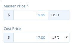
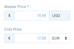
This widget combines both inputs. It comes in two flavours, either with a dropdown for the currency (if it is changeable here) or fixed (where we previously didn't show a currency). I think it is better to always show the currency, both to make it obvious what currency is being used and for consistency.
Examples
Product edit
Promotion Rules and calculators
After

Before

Payment
After

(layout and padding could use some fixing here before the final version)
Before

Try it
To try it out you can clone this down or try a demo on codepen
Implementation
This depends on having the font size match bootstrap's, which @tvdeyen has been working on. The widget uses bootstrap's styling of input addons, for the basic layout.
The selector (when enabled) is a standard HTML
<select>(not select2) with custom styling to make it blend in better. I've done some cross browser testing, and what I have now seems to function well on chrome/FF/IE11/safari.There's a small backbone.js view which watches for changes to the currency so it can update the symbol.