This app shows data visualization. It uses python ML to predict future values of water conditions. It also uses few visualisation machanisms like PowerBI and Tableau by Adaptive Analytics at backend. IRIS BI dashboard also included.
For example, Water Conditions in Europe region data was used. The Dash framework used to build Dashboards in a Python framework created by plotly for building interactive web applications. Dash is open source and building an application using this framework is viewed in a web browser.
The repo is dockerised so you can clone/git pull the repo into any local directory
$ git clone https://github.com/teccod/water-conditions-Europe.git
Open the terminal in this directory and run:
$ docker-compose up -d
The first time launch can take some time because of python libraries installing.
After installation open http://localhost:8080/

The main page will show the links to Dashboards, which display different visualisation tools.
On the left is the navigation menu.
- Home - shows the title
- Timeline - a map is shown, there is a player at the bottom of the map, timeline shows the dynamics of data on the world map
- IRIS BI - dashboard based on IRIS BI technology
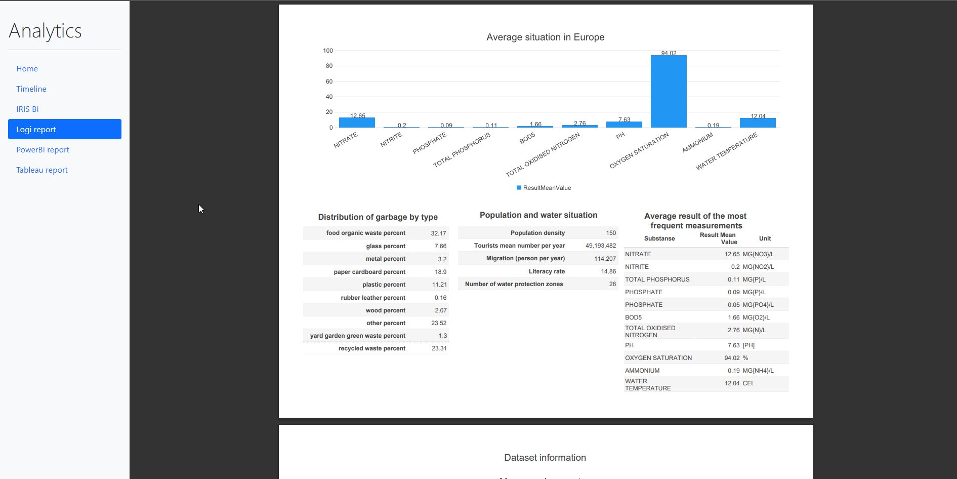
- Logi Report - a PDF form of the Report generated by the Intersystems Reports powered by Logi Reports
- PowerBI Report - dashoard on PowerBI engine embedded
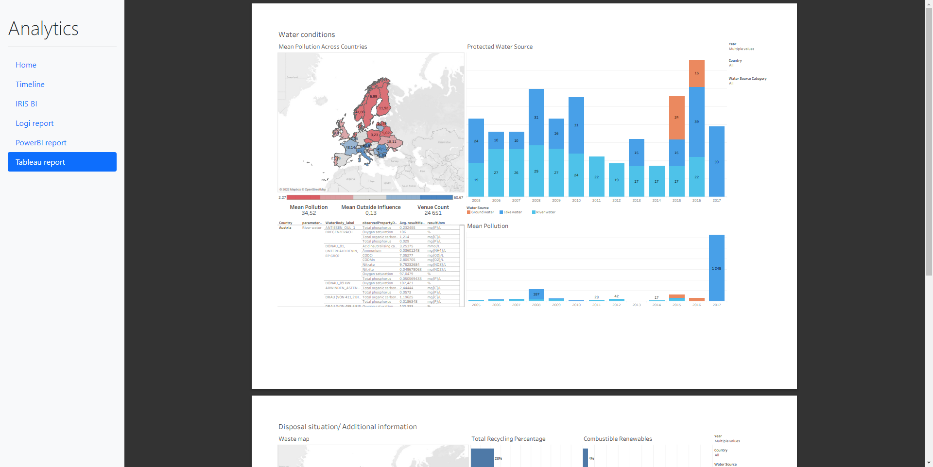
- Tableau Report - dahboard on Tableau engine published from public.tableau.com
Online demo link : http://atscale.teccod.com:8080/


In this article I describe how ML on embedded python used in this project and compare it with IntegratedML test