-
Notifications
You must be signed in to change notification settings - Fork 4.2k
New issue
Have a question about this project? Sign up for a free GitHub account to open an issue and contact its maintainers and the community.
By clicking “Sign up for GitHub”, you agree to our terms of service and privacy statement. We’ll occasionally send you account related emails.
Already on GitHub? Sign in to your account
Use a fixed toolbar for the block toolbar in mobile #18663
Conversation
|
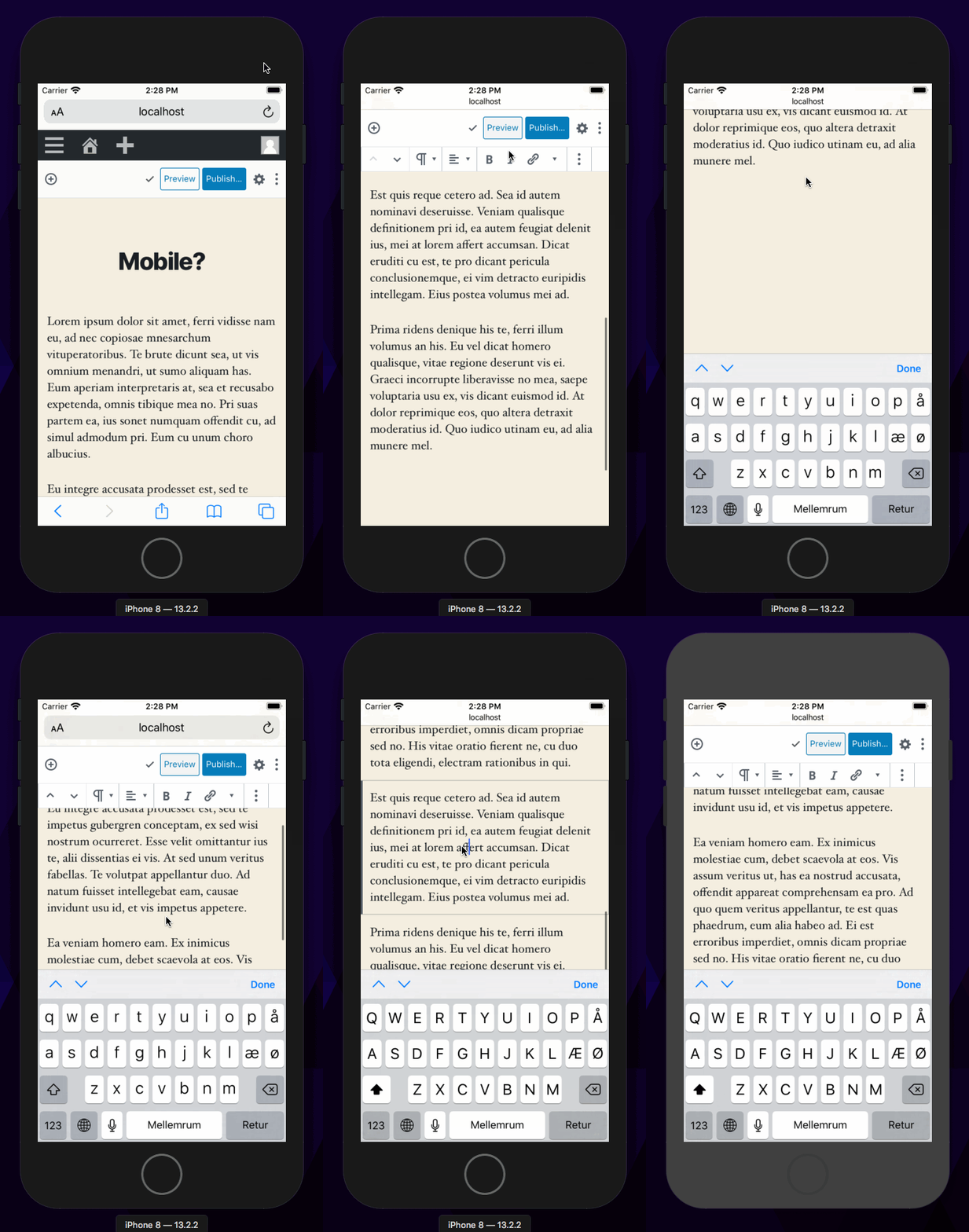
Thank you so much for exploring this. I strongly believe a top-docked toolbar is critical path important to ensuring that the mobile experience is good. However unfortunately this branch doesn't address the fundamental issue as higlighted in the illustration in #7479 (comment). Here's a GIF: You don't have to have a physical device to test, but you have to test it on the actual Mobile Safari for the unique quirks to show up. The way to debug is this:
This opens up a simulated iOS environment, but it's actual iOS and actual Mobile Safari it runs. Better yet it integrates with MacOS, you can copy paste between your dev browser and the URL bar inside the ipad simulator, it’s even bridged so you can run localhost. You can also the Safari on the desktop to inspect inside mobile safari in the simulator. That way you can most literally inspect, tweak, change and test the markup realtime, on the iphone. |
|
@jasmussen Do you know how technically we should solve the issue? Is it by applying "position: fixed"? Right now the header is "position: sticky" on mobile. Also, if we do make it fixed and not sticky what do we do with the Admin toolbar (the black one), should we just hide it entirely? |
|
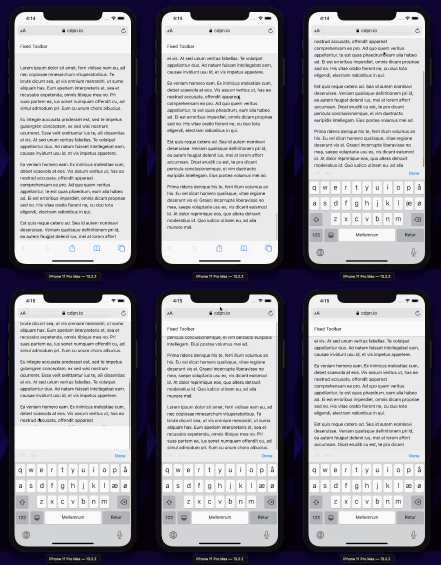
To expand a little bit, for this to work, some things need to happen. We need to change how the toolbar and general layout is created on iOS. This codepen shows something that gets us very close: https://codepen.io/joen/pen/yWWRrm You can test this URL in Mobile Safari in the simulator: https://cdpn.io/joen/debug/yWWRrm/gareYzzyRqPr Here's what that looks like: What's going on here is:
The problem that remains is that if you scroll to the bottom of the page, there's some whitespace there from the body element underneath the resized element that you can still scroll. So we likely need to apply a hack so you can't scroll the body element. |
There are a few options to explore here, provided we find a feasible approach. One is to make the block toolbar sticky as opposed to fixed, so you scroll past the adminbar before that, or we can some some fancy "scroll collapsing". This should be within reach. But I'm still curious whether we can stop the body from scrolling at all, and scrolling only the container, as shown in that codepen I linked. |
|
To be fair, I think you're better positionned to fix this issue as you understand it better :) Do you think you could give it a try in this PR (as time allows). It should all be in one file |
|
I'm not sure I have the skill to explore the ontouchstart hacks probably necessary to make this work. Also CC: @frontdevde as I think he meant to look also. |
|
Thanks for the ping, @jasmussen! After creating #18632 yesterday, I started some more exploration into possible solutions for the remaining issues mentioned. I haven't found a satisfying solution yet though. It's the end of the day for me over here and I'm out of office tomorrow but I'd be happy to continue looking into this next week if we're still in need of a solution. |
|
I'll give that a shot. But in the past we avoided that (fixed bottom) because that would also scroll out of view, and it would vary how much depending on soft keyboard height (zoom level, alternate keyboards, screen resolution). |
|
By the way it's correct that the bugginess of Mobile Safari can only be experienced on a physical device or the simulator. However the specific bugginess I explain in #18686 is only reproducible if you also toggle the soft keyboard, which changes the Mobile Safari behavior to be even more buggy: |
|
@mapk I tried a bottom toolbar. Unfortunately it's a fair bit worse than the top-docked toolbar. The trigger really is that the soft keyboard has to show up, this is what's causing the viewport issues with two scrolling containers and none of them sized correctly.
The issue with being able to scroll the |
|
Superseded by #18686 |


closes #18632
closes #14419
This is the nth attempt to use a fixed toolbar in mobile (See #18632 for the reasoning about why it could work this time).
We need to test this on real devices (which I don't have) and there's probably a bunch of issues I'm missing but on a small viewport on desktop this feels way better than what we had.