-
Notifications
You must be signed in to change notification settings - Fork 4.2k
New issue
Have a question about this project? Sign up for a free GitHub account to open an issue and contact its maintainers and the community.
By clicking “Sign up for GitHub”, you agree to our terms of service and privacy statement. We’ll occasionally send you account related emails.
Already on GitHub? Sign in to your account
Move the block movers to the block toolbar #18685
Conversation
|
Can we also combine with #17352 for the horizontal variant to see how it'd look code-wise? |
|
It's nice to see the reduction in code, this should help us maintain and have more consistent interactions :) |
|
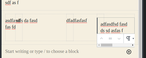
There seems to be this weird bug that happens now. Try creating a columns block and dragging a block in one of the columns to the other column. Suddenly the selected block gets stuck in this weird state where its toolbar is gone and its content is invisible. This does not happen in Aside from that issue, everything else seems to be working fine. I think the drag handle size could be reduced, especially if the move buttons also doubled as drag handles. I think it would be helpful if the toolbar could extend to the left of the block border in tight situations like this one: However, that's probably out of the scope of this PR. |
f3c561a to
afc50e8
Compare
Yes, hard to get right though in a generic way. -- |
|
I've confirmed that the dragging bug is fixed. Something else I just noticed is that mobile now uses the same sibling inserter as the desktop. Also, the toolbar now overlaps the block below on mobile. I think something needs to be done about the sibling inserter. I also prefer the no-overlap behavior of the |
|
Thanks for the feedback @ZebulanStanphill I actually didn't touch the sibling inserter at all, I believe you can still trigger it in master as well. I do think the in-between inserter is not that useful in mobile especially because the inserter is always accessible easily (top of the screen) and has the same behavior but I'm not going to touch these in this particular PR. I'll have to check where the extra padding was added for the toolbar before and restore it. |
|
Ah, I had forgotten about the add button in the top toolbar. Good point. |
6421619 to
b907f0e
Compare
|
With the recent changes to the mobile toolbar, everything seems to be working fine in this branch now. |
|
@youknowriad Hallooo! I tested your update :). I've also been actively testing interactions via prototypes from @mtias 's post on Advancing the Block Interface. I'm not 100% certain about moving the movers to the top bar (yet). After playing around a bit... I have an alternative interaction pattern idea that tried to lighten the UI re: movers. (I don't know if this was tried previously). The idea came from playing around with Notion (they don't use arrows in their mover though). If this isn't the right thread to post this, please let me know! These are my initial thoughts :) As always, thank you! |
|
@ItsJonQ The idea of this PR is to try to move towards the direction of #18667 where the block movers are in the toolbar but hidden under a hover effect. Your proposal is a good alternative but it seems to move us into a different direction than the one suggested in #18667 so maybe we should figure out the path forward there? |
Makes sense! I'll repost my comment there :) |
|
@youknowriad What's needed to move this forward? Any way I can help? |
|
I think we need a design direction here. What's acceptable to ship? Should we implement the "hover to show" effect first? Should we combine the three buttons into one (drag, up and down)? |
|
Here are a couple of explorations. First, literally moving the simplified handles. The issue around this is the benefit of a larger hit area is lost because of the thinner toolbar. Here is a comparison of potential height increase: Notice here the starter border I also moved to the block, which could be worth exploring later. cc @jasmussen for some ideas on this. |
|
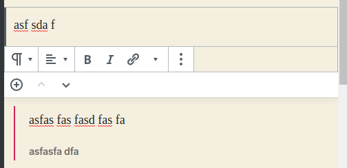
One of the challenges of putting both movers in the toolbar above and below each other, is that it makes the hit area very small, height wise. Currently the toolbar is 36px tall, which means you'd have 18px hit area for each half of the unified control. On mobile it's recommended touch targets aren't smaller than 24x24, and the controls in master right now are 24x28: In #18667 a 48px tall toolbar is being explored, which would give us 24px height, but even then it'd be nice with a solution that makes them even bigger, which is why that ticket also explores showing them when the block type is selected or hovered. An interim solution to moving them to the toolbar today could be exploring vertically expanding the hit aa for the controls, invisibly. Fake it, so to speak, like this: The button invisibly extends beyond the boundaries. However faking it like this does not feel right, and another option is to do the "genie effect" where it increases size when you hover the control. I.e. this: |
|
As a first step, in the last commit, I've made the mover buttons as the draggable element and removed the explicit one. Let me know if that's acceptable for you and whether I should move forward with trying to "merge" the buttons like suggested above. |
The problem here is that right now we only copy the "block content" on the draggable clone which means there's no toolbar there and this uses DOM cloning techniques which means moving the toolbar to a Popover like suggested in #18779 will make this impossible to do. |
|
it might be possible if we change how drag & drop work and move the actual block instead. As you know, I already tried this in a PR and it's very hard to make it work. Not impossible though. So I wonder if we can find an alternative for now otherwise, this might block for some time. |
|
Thanks for clarifying, was about to ask about the alternate method of drag and drop that did not clone. One quick point of clarification — on the draggable clone, could we re-create a faux drag toolbar where the toolbar used to be? One whose sole purpose is to show that changed drag state? |
Potentially, but with very very hacky code as the Drag & Drop is a generic component, this makes it very specific to blocks. |
|
I'd rather try the new Draggable approach again though. Maybe this time, I'll have better luck. |
|
I don't think the dragging state for the toolbar is necessary for this. I consider drag and drop to be a secondary affordance, and one that will have a larger hit area with this change. By the way, the select mode could also be a playground to make the entire block the draggable hit area ;) |
2d7bb30 to
c25b93e
Compare
|
We merged #19322 (toolbar position) into this PR, so the last blocker is gone. I think we're ready to ship this PR. |
|
|
||
| .block-editor-block-icon { | ||
| .block-editor-blocsk-icon { |
There was a problem hiding this comment.
Choose a reason for hiding this comment
The reason will be displayed to describe this comment to others. Learn more.
Looks like a typo here.
I'm working currently on #19344 with the same size toolbar, and with the right overall treatment, it feels great. Feel free to check out the branch, but here's a GIF: |
|
Yes, design-wise this PR is a step towards #19344 |
There was a problem hiding this comment.
Choose a reason for hiding this comment
The reason will be displayed to describe this comment to others. Learn more.
Looks good to me, but would appreciate another check from design.
|
Another small issue I see: when I drag a block, one of the block mover tooltips pops up and stays on he screen while I'm dragging blocks. |
|
Yep. I wonder if it's too soon to do merge this. The exact behavior of the mover control — permanently visible or visible in certain focus situations — is not yet fleshed out. And without the new look, it DOES look big and a lot of the focus styles are off. Should 19344 be a blocker for this one? |
|
19344 is built on top of this branch, so it's already included there, we should just rebase it over this branch (I'll do it). |
|
Let me know if/when you do that and I'll postpone pushing until then. |
|
@jasmussen sorry, just saw the message, I already rebased |
|
This was merged into #19344 and will land with it. So let's close this one. |


closes #18195
closes #18069
closes #18223
closes #16617
Related #18667 #18632
This PR moves the block movers to the block toolbar consistently.