-
Notifications
You must be signed in to change notification settings - Fork 4.2k
New issue
Have a question about this project? Sign up for a free GitHub account to open an issue and contact its maintainers and the community.
By clicking “Sign up for GitHub”, you agree to our terms of service and privacy statement. We’ll occasionally send you account related emails.
Already on GitHub? Sign in to your account
Try G2 #19344
Try G2 #19344
Conversation
be6191b to
e93a5cd
Compare
|
I am just exploring this a little and I feel the dots on the placeholders are a bit much with text. I personally find it hard to read. I wonder if a balance could be done to make them less strong @jasmussen? For me, there is an almost wave visual created that doesn't help text read clearly. |
|
I would tend to agree specifically with the dots as they are. They are meant to indicate the presence of a grid which blocks align themselves to. This is probably an aspect of the design that is worth postponing implementing until we can actually support a grid for the blocks. I'm catching up on a few things today, but will give this PR a spin as soon as I can, perhaps help push some polish as well! |
|
Thanks so much for taking a stab at this, Riad! I'm very excited to see the new UI explored, and I've been wondering how to best do it. I'm increasingly leaning towards a big switch, like this, rather than implementing things piecemeal. I took this for a quick spin today, and it's exciting to explore as a prototype currently and as something that can grow into the real thing. There are a lot of little things I can help fix in code — the right black, the right border radius, the right spacing for icons, the right menu treatment, the right placeholder treatment, right toolbar positioning — mostly a massaging of pixels. But it's also likely going to be a great deal of CSS and code refactoring (touching a lot of files), so I'm currently pondering how to best help, rather than just jumping in and pushing code. To be sure, this is the right branch to work in, correct? Or should I work in your "g3" branch instead? One thing that does seem worth exploring separately, is any conversations around icons and fonts, which are tentatively explored also in the #18667 ticket. |
|
The reason for g2 and g3 branches is that I think we can probably land half of the changes (all the changes within the canvas) before the other half (the panels, the bordered dropdowns). So if it's something in the canvas itself, push to this PR (and potentially rebase g3 on top of it) and if it's outside the canvas, it's the other one. That said, if you don't think that split make sense, we can work on a single branch for everything. I personally do like 2 branches because the whole thing can become huge and instead of one giant PR, if we can do two bigs PRs that's a win. |
|
Cool, I'll think for a bit. I'm also thinking in terms of introducing some grid/dimension variables and the new black color in a way that is leveraged by both. |
|
I'll be pushing some work today. Right at this moment I'm going to try the following approach:
Icons and font discussions we postpone, I would suggest. |
|
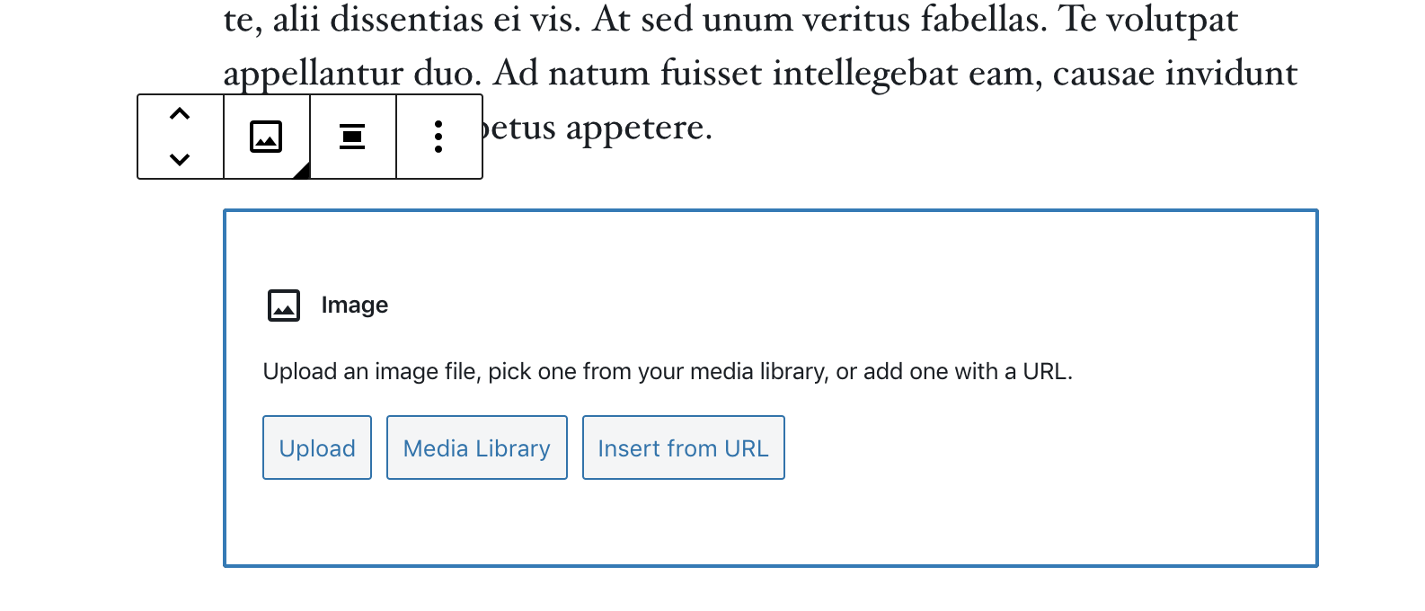
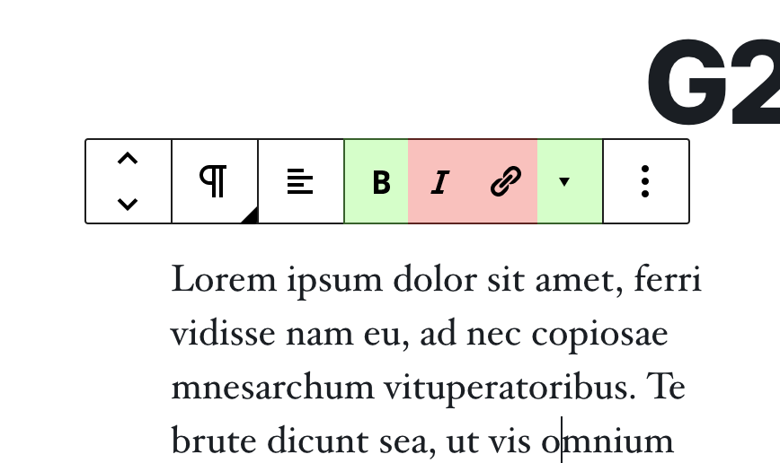
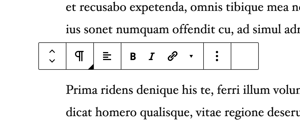
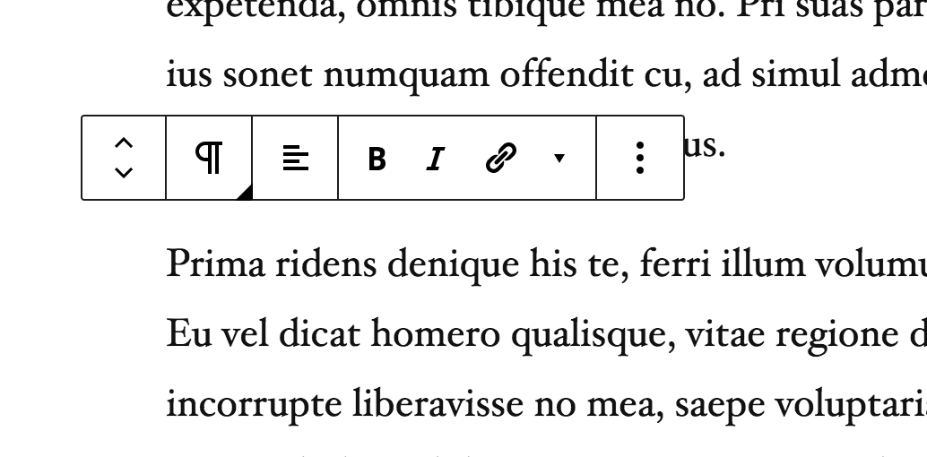
Alright, I pushed a bunch of polish. The placeholder grid is gone for now, and it has a 2px border radius to match the mockups: It has a focus style that is the beginning of a unitified theme-color 2px focus style we can use everywhere: I added new grid system variables, and cleaned up the code that paints borders around buttons, so they're all square: Note how the formatting buttons are also optically spaced: That is — when multiple buttons are shown next to each other, the middle ones are 36px, and the ones on the edges are 36px + 6px padding. This is based on the overlap the 48px buttons would have, in order to be optically balanced: There are a number of issues remaining, which I will help take a stab at. However before jumping into that, @youknowriad (get well soon!) I hope you can help me with a good rebase on this one. I know that @ellatrix has refactored the canvas a fair bit, removing dom nodes left and right, so before I go styling elements that no longer exist, it would be good to rebase. If you feel like squashing a couple of your smaller commits too, that would be fine ;) Some of the remaining issues I hope to look at include: Problem with focus on floats and other non-text blocks Problem with the toolbar needing to be detached so it can align left and right I don't know if that should be this branch, but the whole G2 concept of a detached toolbar kind of hinges upon it. Especially since we're still figuring out the exact behavior if the mover control; it's actually the block switcher that's supposed to align with the left margin on the block. There's an extra border on the first block when you're multi selecting Also:
Again, fonts and icons, and actually colors also, we'll look at separately. |
| @@ -4,10 +4,16 @@ | |||
| width: 100%; | |||
| overflow: auto; // Allow horizontal scrolling on mobile. | |||
| position: relative; | |||
| border-left: $border-width solid $border-color; | |||
| height: $block-toolbar-height; | |||
There was a problem hiding this comment.
Choose a reason for hiding this comment
The reason will be displayed to describe this comment to others. Learn more.
Does this work in all breakpoints and top toolbar, I think this generic component is meant to be shown with different heights, so maybe it should be unopionated?
There was a problem hiding this comment.
Choose a reason for hiding this comment
The reason will be displayed to describe this comment to others. Learn more.
Done!
packages/base-styles/_variables.scss
Outdated
| $block-controls-height: 36px; | ||
| $icon-button-size: 36px; | ||
| $block-controls-height: 36px; // @todo: This should be deprecated in favor of 48px block control heights. | ||
| $icon-button-size: 36px; // @todo: This should be deprecated in favor of 48px block control heights. |
There was a problem hiding this comment.
Choose a reason for hiding this comment
The reason will be displayed to describe this comment to others. Learn more.
This I think is useful for the default button size (and all what should have its size)
There was a problem hiding this comment.
Choose a reason for hiding this comment
The reason will be displayed to describe this comment to others. Learn more.
Can you elaborate on what you mean here?
There was a problem hiding this comment.
Choose a reason for hiding this comment
The reason will be displayed to describe this comment to others. Learn more.
I mean I don't really understand why this is deprecated. The button size is still 36px across the UI (aside toolbars)
There was a problem hiding this comment.
Choose a reason for hiding this comment
The reason will be displayed to describe this comment to others. Learn more.
Oh, good point. I suppose I'll remove those Todos for now. I think there is some variable cleanup todo here so that there isn't any confusion — "icon button" could refer to formatting buttons which should be 48x48, also on mobile, and perhaps even in the toolbar, wheras yes, the traditional blue primary and secondary buttons are 36 in height.
I'm speaking specifically about the clickable hit area also.
| // They are 36px, except for the first and the last, which have | ||
| // an additional 6px padding left or right. | ||
| .components-toolbar > div { | ||
| width: 48px - 6px - 6px; |
There was a problem hiding this comment.
Choose a reason for hiding this comment
The reason will be displayed to describe this comment to others. Learn more.
I wonder if it's possible for third-party plugins to add formatting buttons that are not icons but text (so not square).
Can we achieve the same behavior without forcing a width?
There was a problem hiding this comment.
Choose a reason for hiding this comment
The reason will be displayed to describe this comment to others. Learn more.
Addressed this in 0417c92, but it's a little messy and specific. Advice is welcome, but I'm also hoping to revisit this.
|
Great thoughts Riad, I will try to address those tomorrow as I continue with this. When you're well again, I would appreciate your help with a rebase! |
|
The rebase was a little bit painful :) I hope I didn't break anything. |
| &.is-visible { | ||
| width: auto; | ||
| opacity: 1; | ||
| pointer-events: all; | ||
| } | ||
| } |
There was a problem hiding this comment.
Choose a reason for hiding this comment
The reason will be displayed to describe this comment to others. Learn more.
@ellatrix I feel the inserter shouldn't be part of the BlockToolbar DOM node at all, it makes styling more difficult. Could we return maybe a fragment and move it out?
There was a problem hiding this comment.
Choose a reason for hiding this comment
The reason will be displayed to describe this comment to others. Learn more.
Sure. I moved it here temporarily. We can move it somewhere else and reposition.
|
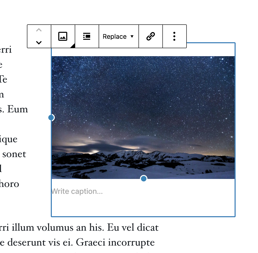
Alright, did some cleanup and made progress. Improved the focus styles: Unified them with block selection styles: Improved positioning of resize handles in a more generic way: Optical balancing of icon hit areas in toolbar, rewritten to work with any component groups: Still on the ToDo:
So there's still a ways to go for this branch to be ready to merge. |
|
@jasmussen in the format toolbar, when you click the buttons, you'll notice that the focus style is not centered properly and that there's jumpiness when you "toggle" formats. |
|
Yep, that's one of the things I mean to look at now. |
|
Refactored focus, hover and toggled states for the block toolbar today: For this particular effort, I'm trying to unify on a single visual style (2px rounded) that is the same for:
Aside from being a single identifiable focus style, it works well with things that are bordered, such as the placeholder and text input fields, in that the 1px to 2px border becomes a shape change so that it does not need to also have contrast change. However this is a change from the 1px style, and while I vastly prefer this personally, I could use a sanity check. Similarly — we need a visual treatment for a button that is toggled and focused. Here's what I have so far: That is, a white inner halo. However in being inset, that makes the icon square. Can we do better? CC: @mtias @pablohoneyhoney |
|
I like the code refactoring, I personally prefer a 1px focus style design-wise though. |
|
Size Change: -811 B (0%) Total Size: 865 kB
ℹ️ View Unchanged
|
|
Don't tell anyone ;) |
|
ᕕ( ᐛ )ᕗ |
|
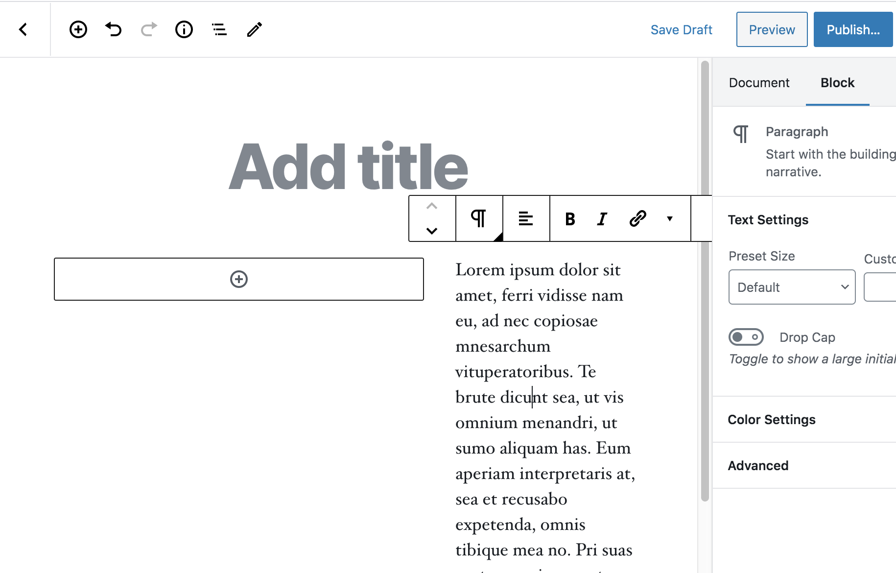
Big improved look for the block editor. The inserters are far more visible and make for better usability. The tool bar, when attached to blocks, now becomes fixed as you scroll blocks up. Useful when working larger layout blocks. |
|
The Desktop/Tablet/Mobile preview modes are welcome but the viewports don't represent or render what you see on the frontend. Toolset now has these in Views but their viewports are different widths than those in the block editor and likewise are not as faithful to what is seen on the front end. It seems to be me that blocks are not as sharp in this respect as what you get with page builders such as Divi. |
|
@irishetcher Yeah, the preview modes are still limited by the differences between the editor and front-end styling. A lot of work has been done lately to reduce the differences between the two, e.g. #19701, but there's still a lot of work to be done. The move towards block-based templates in themes, full site editing, and the global styles system will all be involved in making this a reality. Relevant links: |








closes #18195
closes #18069
closes #18223
closes #16617
closes #19624
closes #7646
closes #19018
closes #12260
closes #15489
closes #20086
closes #4287
closes #9522
This branch should be used to serve as a base branch for all updates related to this issue #18667 that can't land individually.
For now, it contains: