Should big cubes have numbers in them? #13
Comments
|
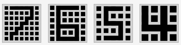
Here's what I came up with; the 7 is a bit off though. Individual SVG files here: |
|
This is pretty cool. I don't think the 4 or 5 tho is needed and yeh 7 looks
a bit off. Also for 6 how does it look using the negative space? (it's sort
of awk right now since using the blackspace the top of the 6 is bigger than
the bottom)
…On Jan 3, 2017 6:42 PM, "AlexMaass" ***@***.***> wrote:
Here's what I came up with; the 7 is a bit off though.
https://i.gyazo.com/e1ecd122fe883c391b5d258b043afa6b.png
Individual SVG files here:
http://svgshare.com/i/Tr.svg
http://svgshare.com/i/VN.svg
http://svgshare.com/i/Ts.svg
http://svgshare.com/i/TG.svg
—
You are receiving this because you are subscribed to this thread.
Reply to this email directly, view it on GitHub
<#13 (comment)>, or mute
the thread
<https://github.com/notifications/unsubscribe-auth/AAmONf6l9jqhxOSiIUwxdD2cMqTeg-mqks5rOwcJgaJpZM4GIrx8>
.
|
|
eh I see no harm in adding them in, but we'll see. |
|
yeah I was thinking to the effect of (but done properly) maybe instead something just off centered would work better for the 6 and 7 like (look very zoomed out)
|


|
ooo those all look cool figured out how to make the 7 not look off, the latter is meh though; its inconsistent compared to 4-6 https://i.gyazo.com/33a77fa1f4c667f84dba48eafa0eb33c.png this seems like a simple fix for 7 @jfly would you be willing to add in the icons i've proposed (but with this for 7: https://i.gyazo.com/33a77fa1f4c667f84dba48eafa0eb33c.png ) I would need to add do 4bld and 5bld but those should be easy |
|
Yeah that 7 looks better. Still overall for 4-5 I don't really see the point and would prefer to avoid them (if enough people think otherwise then could merge them assuming there were suitable 4bld and 5bld changes) and for 6 it's kind of too lopsided. If other people have opinions would be good to hear. |
|
yeah the 6 looks a bit unnatural; I tried this: https://i.gyazo.com/d49ce64ffabc4396570bf946799f7976.png also I believe there is a point to having the 4-5, on the registration list on the wca for example, the icons are small so it would be quite beneficial to make them have numbers (see what 4-7 look on registration lists on wca website right now) https://i.gyazo.com/1d66e4cf420d9175c2fe44a7fa8f2714.png anyways, I am hoping these changes I have proposed can be added, let me know what you guys think |
|
Wait I'm not sure where it looks like that they are much larger for me when I check registration pages. Do you use <100% scale on your web browser? |
|
no i use 100 percent scale on my web browser |
There have been a lot of proposals in this thread. I've asked @alexmaass to write up a google doc summarizing all the ideas. After that, I think @FatBoyXPC, @keemy, and @jfly (that's me!) will vote on them (of course, agreeing to do something isn't the same thing as actually doing it, but we'll burn that bridge when we get to it) |
|
@alexmaass, as for how the icons appear over on https://www.worldcubeassociation.org/competitions/ImaginaliaOpen2017/registrations, that probably more of a WCA website problem. What I mean is that the icons on that page are damn small, and maybe we could redesign so that the icons are not so dang tiny. That all said, it'll be interesting to see what that page looks like after we tweak the big cube icons. |
|
https://docs.google.com/document/d/1Hxx_fu9MJr5k4ESqIACPhUI_fzXCFhBt-iFrh6KlSKY/edit?usp=sharing |
|
So, I think the numbers covering the squares are a cute idea, but they are unreadable. I'm imagining we only get one tint color, but can we reduce the individual squares to small dots? |
|
Also, I suggest making a "European" 7 with a horizontal stroke for maximum clarity. |
Yeah, we're targeting a font, so it has to be true black and white. Can you provide quick and dirty mockups of any ideas you have? |
|
|


|
@lgarron but these aren't cubes, and ticks on 7s are terrible. |
|
@lgarron, I like that they are readable at 14px wide :) I do like ticks on 7's. Other no-tick styles are ok too though: |


|
I have to agree with keemy, these represent cubes, so it is logical to have squares in it instead of circles. I strongly disapprove of the usage of circles. Maybe it would work to make the inner squares smaller? And for what jbcm627 has suggested, I think that looks great! |
|
@keemy could you update the svg files I suggested with smaller squares (also with the revised 7 jbcm has suggested)? unfortunately my SVG skills are too limited to do it accurately enough for final usage. |
|
In case you want, the files are at https://drive.google.com/open?id=0B6FmQe6bc6yVQTVDbTJRWjBzeEk |
|
Some variations:
I think I prefer |


|
Yeah, squares-12-lines-20-square without the dashed 7 looks better and more readable in my opinion! |

|
I vote for the icons @alexmaass just posted here. @lgarron, @keemy, @FatBoyXPC: what say you? |
|
I still prefer the European 7 for the most-clear, most-connected option. :-) But if we want the broken 7, what about these options?
|


|
Also note that bigger cubes get pretty thin. Perhaps we should use squares-12-lines-24-square for those.
|

|
what about trying double wide on the 7 ? |
See discussion over on cubing#13.
See discussion over on cubing#13.
|
Also, heres a thicker 7:
|

|
okay please no, this looks quite bad, though this was still worth trying out to see how it looked |
See discussion over on cubing#13.
|
So is this issue stale now? |
|
I agree, I think we can close this. It's an interesting piece of history if someone does want to revisit this, but I'm not losing any sleep with how things are right now. |
Has this been discussed before? They are kind of hard to differentiate right now. @lgarron, I feel like you'd have an opinion here.
The text was updated successfully, but these errors were encountered: